Website2026-08-21
Apartment 11/61 at Kraljevi Čardaci — sale and rental on one bilingual website
An apartment in an aparthotel on Kopaonik that is both for sale and for rent. One page has to serve two completely different visitors: the one looking for a weekend stay and the one thinking of buying. All this in two languages, without a contact form and without an agency in between.
- Client
- Bratislav Rajković, owner of apartment 11/61
- Activity
- Rental and sale of apartments in Kopaonik
- Area
- Kopaonik, weekend settlement
- Type
- One-page site with bilingual content
- Languages
- Serbian (sr-RS) and English
- Technologies
- Next.js 16 · React 19 · next-intl · React Three Fiber · Lenis
- Status
- Live since May 2026, on my subdomain
- Technology
- Next.js 16 · React Three Fiber · next-intl SR/EN · Tailwind · Lenis
Problem and context
Apartment 11/61 and its owner
Apartment 11/61 is located in the eleventh building of the Kraljevi Čardaci Spa aparthotel complex, in a weekend resort on Kopaonik. Sixth floor with elevator, separate bedroom, living room with kitchen and bathroom with shower — accommodation for four people. The owner is Bratislav Rajković and everything is arranged directly with him, without agency and without commission.
The apartment has two lives at the same time. It is issued by the day, weekend or week, and at the same time it is for sale, with a price to be determined by invitation. The guest of the apartment can use the spa center of the complex of 1500 square meters for an additional fee at the reception, with a discount compared to the daily ticket from outside. This is also the reason why this apartment is not the same as an apartment in a weekend resort: the customer also gets the right to use the facilities that the hotel takes care of, not just the square meters that he takes care of himself.
One thing right now, to make sure there is no confusion. The site is on my subdomain kraljevicardaci.svilenkovic.rs, not on its own domain. The owner is a real person, the apartment exists, the phone number on the website works and the website has been live since May 2026. What does not exist is a separate domain — he did not take it, so the website lives with us. None of the figures on this page are made up, but neither are they presented as work for an outsourcer with their own address.
What needed to be solved
The request was not "make a website for an apartment". It was narrower and heavier than that:
- Two visitors on the same page — a guest looking for accommodation for three nights and a buyer considering a property do not read the same text and decide at the same pace. Both of them have to find their own, without either of them feeling that they have fallen on the other's side.
- Two languages without mixing — Kopaonik also has foreign guests. A site where half of the content is in Serbian and half in English is worse than a site in only one language.
- Contact without form — the owner works by phone and Viber. A form that sends him an email that he does not read would not be a service but an obstacle.
- There are no photos of the apartment — he did not send them. The site had to look good without them, and without a single image that would make the customer expect something they are not getting.
The last point stated more than it sounds. Early in the development, there were four photos of apartments of the same type on the website, as an illustration. They were thrown out, because the buyer of the property is the last person who should be shown someone else's room. The official photos of the complex and the spa center remain, and at the bottom of the page there is a sentence that clearly states that these are photos of the aparthotel and that the apartment provides access to these facilities. An empty space where the interior of the apartment should be is still waiting for the owner's photos.
One page, eight sections
Everything is at one address. Navigation does not lead to subpages but to anchors: About the apartment, Sale, Wellness, Activities, Location, Questions and Contact. For content of this volume it is a more honest choice than the five thin pages that exist only to have menu items.
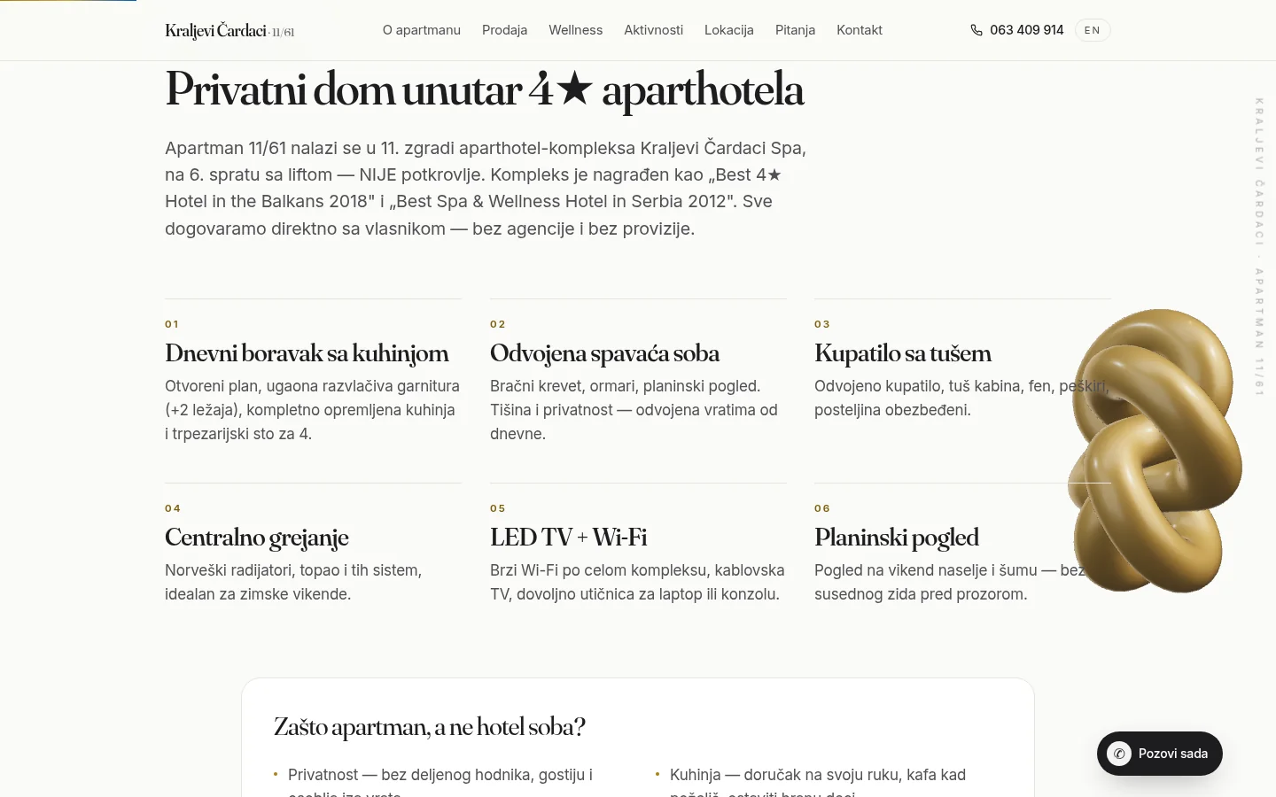
The order follows the way it is decided. First, what is the apartment, and only then the sale — because a person who came through a search for accommodation should not come across a purchase offer in the first sentence. The apartment section is divided into six tabs: living room with kitchen, separate bedroom, bathroom with shower, central heating, LED TV with Wi-Fi network and mountain view. Below them is a short list of reasons why an apartment rather than a hotel room — privacy, kitchen, flexible check-in and check-out.
One detail is repeated in four places, and it is on purpose: Building 11, sixth floor, elevator — not an attic. It is in the introduction of the apartment section, in the sales data table, in the search description and in the questions. People who shop on the mountain ask this question every time, and the answer found only in the fifth question arrived too late.
foreign
Sale and rental on the same page
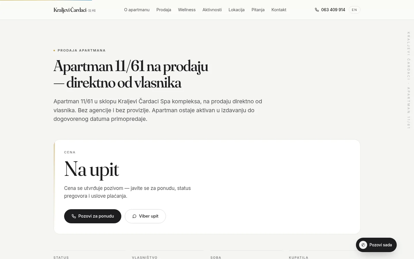
The section Sale of apartments is the only part of the site that speaks exclusively to the buyer, and that is why it is the strictest. There is no descriptive text that goes around the topic. It has a price card that says On request and one sentence explaining why: price is determined by call, along with negotiation status and payment terms.
Below the price is a table of eight facts that the buyer is looking for before even calling: status, ownership, number of rooms, bathrooms, position in the complex, heating, equipment and parking. Along with them, a list of what is included in the sale — furniture, appliances, bedding, rights to use the contents of the complex, a parking space and the existing base of rental guests from the rental, with the possibility that the new owner will continue to rent.
That last one is what differentiates this section from ads. An apartment in a complex that is already for rent is not an empty property; it is an operating rental, and the buyer must see it in writing, not guess it. That is why in the same section there is a strip reminding that apartment i is for rent until handover, with a link to the reservation page.
The price is deliberately not written on the website or in the structured data. The amount that expires on the real-estate portal is worse than the omitted amount — once published, an outdated figure remains in the browser cache and in other people's screenshots longer than in negotiations.
Two languages, without automatic switching
The Serbian version is at the root of the address, english on /en. All content is data, not code: texts, titles, search descriptions and questions are in two translation files, so the languages cannot diverge by changing something in one place and forgetting it in another.
Automatic browser language switching is off, and that was a conscious decision. While it was on, a visitor with an English browser was getting an English page where some of the remaining texts were Serbian, so the whole site seemed half-translated. Now everyone gets the Serbian version and clicks on EN himself if he needs it. Less intelligence in the system, more predictability for man.
Lagged Serbian texts were found and transferred to translations — the floor label in two positions and the text of the button in the rental section were hardcoded, so the English version spoke Serbian in those places. It is searched by searching our characters and our words in English HTML; if something is found, the translation is incomplete even though the page looks neat.
There is a trap under it that cannot be seen. Setting the prefix for the default language with its own prefix map causes the root of the address to redirect endlessly — the page doesn't open at all. The solution is simple once you know: the default language does not get its own prefix map, but relies on the default behavior, and then the root works, and English lives on its prefix. The site also has hreflang tags for Serbian, English and the default variant, the same in the header and in the sitemap.
3D that doesn't cost a phone
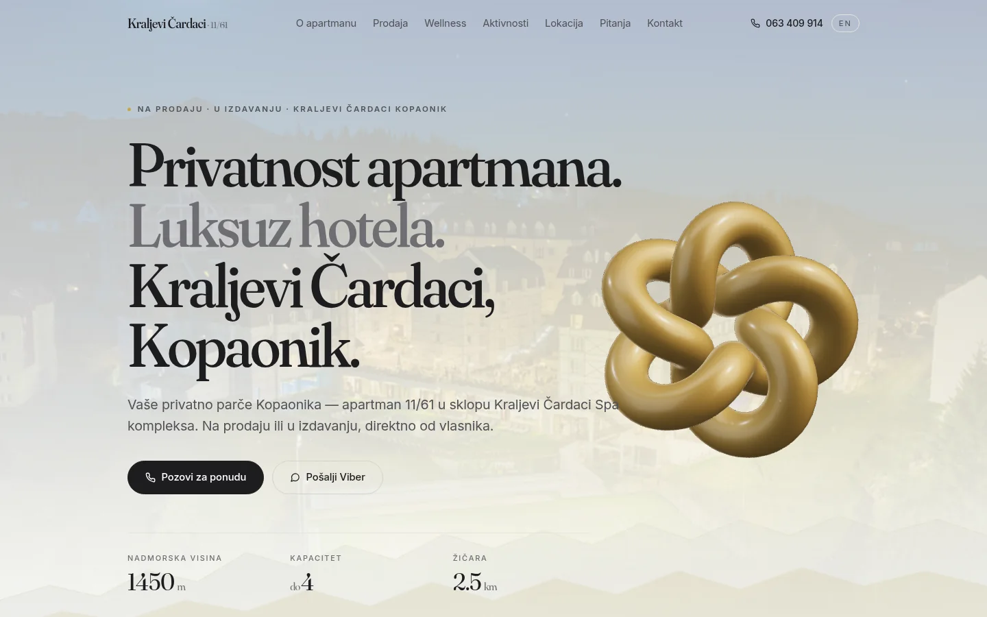
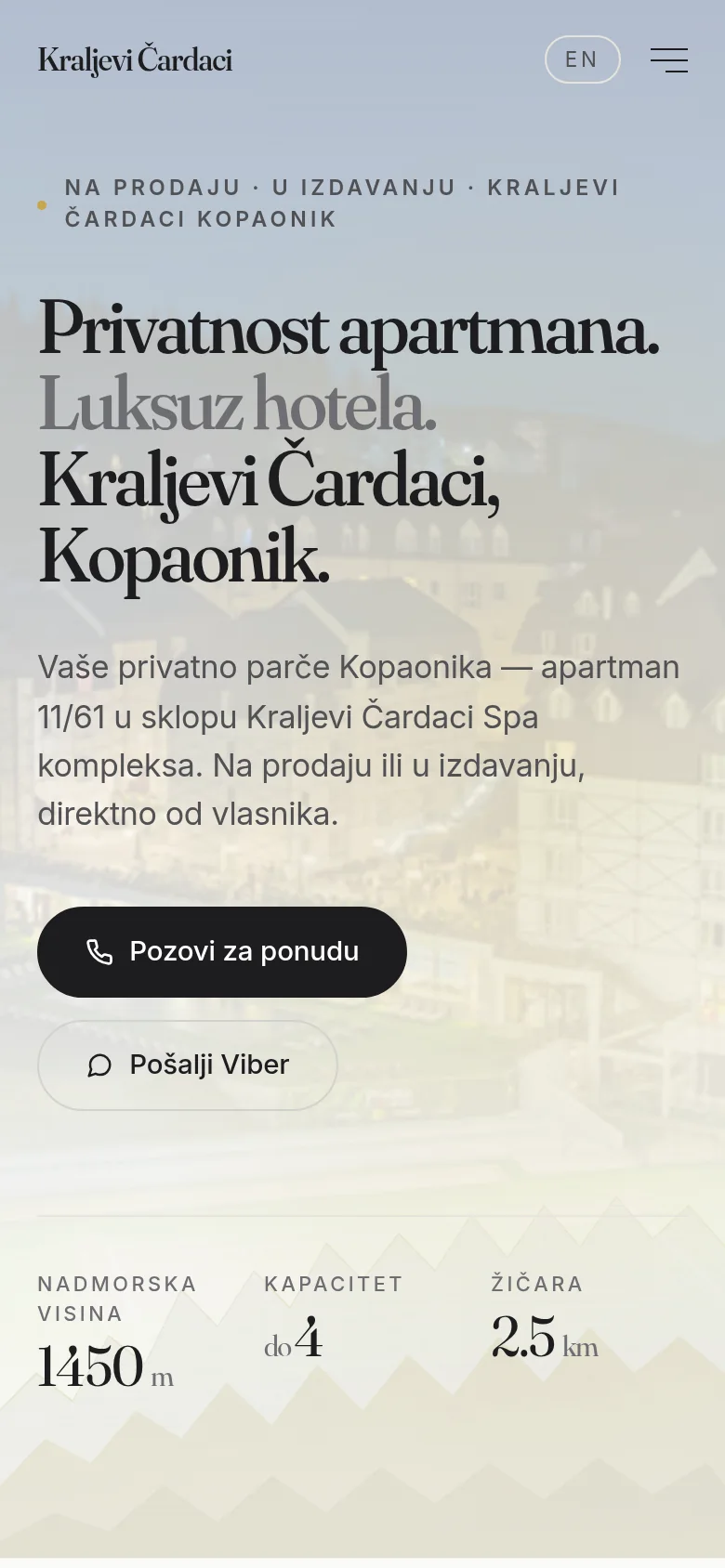
On the desktop, the header spins a gold geometric loop, made in React Three Fiber — a triple torus knot with a thin gold accent, a slight hover, and a soft shadow underneath. No environment from the network, with manually set three light sources, because this avoids loading an external lightmap, which the site's security rules would reject anyway.
It is worth saying that it was difficult to get to that scene. The first version of the site was dark, with a crown and a couple in the background; it was discarded and replaced by a calm, bright look. After that stood the rotating marble obelisk, which was also dismissed as a failure. The loop is the third attempt and the first one left. None of the three versions was technically worse than the other — the difference was whether the scene fit the apartment marketed to serious people.
What remains from all versions is the rule of how such a scene is put into operation. Before it is even mounted, the code checks that the browser can actually draw 3D graphics; if it can't, a smooth color transition is displayed in that place and no one sees the error. Editing is delayed for a moment after the first rendering of the page, so that 3D does not steal bandwidth from what the visitor is actually waiting for. There is no scene width below 768 pixels — neither the canvas nor the library is loaded on the phone, so the amount of code downloaded on the phone is many times smaller than on the desktop.
The snow falling across the page is not 3D, but about twenty ordinary elements with pure CSS animation and random deflection for each snowflake — there are half as many on the phone. Zero work per thumbnail for something that's just decoration anyway.
Motion that doesn't move content
Scrolling is smoothed out, and sections are revealed as they come across. The entire motion runs on its own tiny pieces of code, not a large animation library: detection on entering the viewport, parallax tied to the screen thumbnail, a magnetic button that follows the mouse and fades out on touch screens, counters that go up when it's their turn, and a header that fades when the page scrolls.
Entry detection has a safety net. If the viewer does not report the element for any reason, after two and a half seconds the content is displayed anyway. An animation that forgets to start is a blank page, and a blank page is worse than a page with no animation.
Also, everything is animated by movement, not transparency. The reason is concrete: an element standing with zero transparency off-screen breaks the automatic accessibility check, because the tool measures the calculated style and sees the text without contrast. By switching to scrolling, the content is visible from the first drawing, the check passes, and the effect is the same.
At the bottom right is a call button that appears only when the visitor passes the first screen and expands into a call and Viber. While hidden, an attribute is used that removes it from both the accessibility tree and the tab queue — because a wrapper containing buttons must not just be marked as hidden for screen readers, that's an error that the check finds immediately. Content displacement when loading is zero on both desktop and phone versions.
Speed, contrast and one concession
On desktop, the site scores one out of one in all four Google measurement categories, with the largest element rendering in less than a second. On the phone, performance is around eighty, while accessibility, good practices and SEO remain on the table.
That number on the phone is not an oversight but a concession, and it's fair to say why. Headings use a two-axis variable serif font, which carries about two hundred kilobytes and in itself raises the time to display the largest element. That font is what gives the site the look it was created for. A replacement would improve the number and spoil the impression, so it was deliberately kept — and the possibilities of shortening it later, if ever decided, are known and written down.
Contrast is a separate business. The gold color standing on a light background has a ratio of three and a half to one, which is too little for the text — so the gold is left only for decoration, and the darker variant is used for the letters, which is eleven to one. The same check also knocked down the standard blue for links, which was one-hundredth below the threshold; it has been replaced by a darker blue that passes with a margin. The language mark of the document is set in a layer that knows which language it is, because it doesn't know the root.
Both versions pass W3C verification without a single error. The last one that was lagging was about the map: the frame with the map was inside the link, which is not allowed. It was solved by placing the link as a transparent overlay over the map, until the map receives a click — the behavior for the visitor is the same, clicking anywhere on the map opens Google Maps.
One failure was not seen in either the code or the speed. An IPv6 record was published for the domain that the server does not have, so visitors with an exclusively IPv6 connection encountered silence. Dual users were saved by the fact that the browser switched to IPv4 after a short wait, so the problem was not noticed for years. It is fixed in DNS, on all hosts from the same group.
A schema that knows the difference between selling and issuing
Structured data did more work on this site than anything else, because Google had to understand that one object stood in two different relationships at the same time. The graph has eight nodes: the apartment itself with coordinates, contents and information that it is inside the complex; complex as a resort with category and awards; accommodation facility; the owner represented as a Person; real estate advertisement; site; questions and answers; and the path through the categories.
The key detail is in the offers with the apartment. Instead of one general offer, there are two, distinguished by business function labels from a dictionary that Google understands — one says that the object is for sale, the other that it is for rent. The search engine then chooses which type of rich result to display: real estate or accommodation. Without that difference, the site would be arguing with itself in the search results.
Seventeen questions and answers are not copied into the scheme manually — they are generated from the same translation file from which they are printed on the page. This eliminates the most common mistake: that the answer is changed on the page, but remains the old one in the structured data. Ratings and reviews are not included, because there are none; a fictitious rating is the fastest way to get a side out of the results.
The titles and descriptions for the search were shortened in one pass — the Serbian title from one hundred to sixty-three characters, the description from three hundred to one hundred and fifty-six, English similarly. Too long description is cut by Google, so the last third of the work was invisible. The telephone was removed from the title, and the phrase Kraljevi Čardaci, Kopaonik was introduced into the main page title, which until then was only in the small supertitle.
The image that is displayed when the link is shared on networks was completely broken and was returning a server error. This is due to two pitfalls of the tool that draws that image: one way of displaying elements is not allowed, and each element with multiple children must explicitly say that it distributes children. In addition, the execution has been moved from the edge environment to a regular one, because the edge is unreliable on its own server. Now the image works in both languages, with our letters.
Outcome
Contact without form and what the owner has at the end
Contact section has no form and will not have one. It has the owner's name, phone number, and Viber, and several of the same calls to action spread across the page — in the header, in the cover, in the sales section, and in the hover button. The owner does not open the mailbox every day and has said so in advance, so the form would be a place where inquiries remain silent.
For a site with two contact channels, this means something unexpectedly pleasant: nothing to maintain. There is no database to fail, no form inbox to attract spam and no admin panel to secure. The cost of that choice is that the content does not update itself — the texts are in translation files and are changed by editing, not through administration. For a page that is updated once or twice a year, it is cheaper than a panel that would be written and maintained.
For the same reason, the site also has a link to another apartment of the same owner in the center of Kopaonik. The link goes in both directions and is written in the structured data, so the two sites form a connected portfolio, and not as two unrelated ads. A guest who came for a larger apartment and found a smaller one can still consider the alternative.
Analytics works with consent according to the Consent Mode v2 standard — until the visitor accepts, measurement is turned off, and the cookie bar offers both opt-out and settings. The certificate is under auto-renewal, the security headers are set in a full set and stand only once, without duplication between the application and the server.
The rest is what we cannot do instead of the owner, so let it be written. The site technically has nothing to hold it back in search, but until ownership is verified in Google Search Console and a sitemap is submitted, the young subdomain is slow to get indexed. Photos of the interior of apartment 11/61, which only the owner can provide, are still missing. Everything else is in place and waiting for those two steps.
FAQ
Frequently asked questions
Why one page and not a multi-page site?
Because the content is so demanding. One apartment, one owner, one complex — five thin subpages would exist just to have menu items. Navigation here leads to anchors within the same page, so the visitor never waits for a new load.
How does one page serve both the customer and the guest?
By sequencing and separation. First, what the apartment is, and only then the sales section, which is the only part intended for the buyer and keeps all his information in one place. For search engines, these two relationships are written as two separate offers, so that the site does not appear in the results with the wrong type.
Why does the site not have a contact form?
Because the owner works by phone and Viber, not by email. A form that sends a message to an inbox that is rarely opened helps no one. The phone number and Viber are in several places throughout the page, including a button that follows the visitor as he scrolls.
How much does the 3D scene slow down the site?
Not at all on the phone, because it doesn't load there — neither the canvas nor the library. It is installed on the desktop only after the first drawing of the page and only if the browser can really draw 3D graphics. If he can't, there is a smooth color transition in that place and the visitor doesn't see any error.
Can the owner change the text and price himself?
Not through the panel, and that is a conscious decision. The content is in translation files and is changed when the site is changed. For a page that is updated once or twice a year, writing and maintaining the administration would cost more than the changes themselves. The price of the apartment is deliberately not written down with a number anywhere, but is on request.
What is needed for such a site to appear in the search?
Technically, everything is set — titles, descriptions, structured data, sitemap and language tags. It remains to confirm the ownership in Google tools and submit the sitemap, which is done by the account owner. A young subdomain without that enters the index slowly, no matter how clean it is.
Up next
Related projects
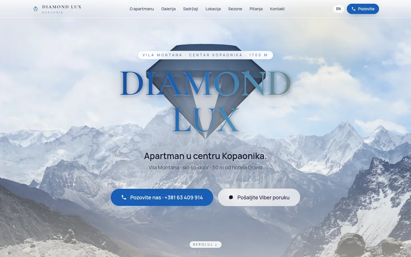
Diamond Lux Kopaonik
Apartment in the center of Kopaonik on one page — two languages, WebGL diamond through the entire scroll and reservation by call, without reservation form.
Case study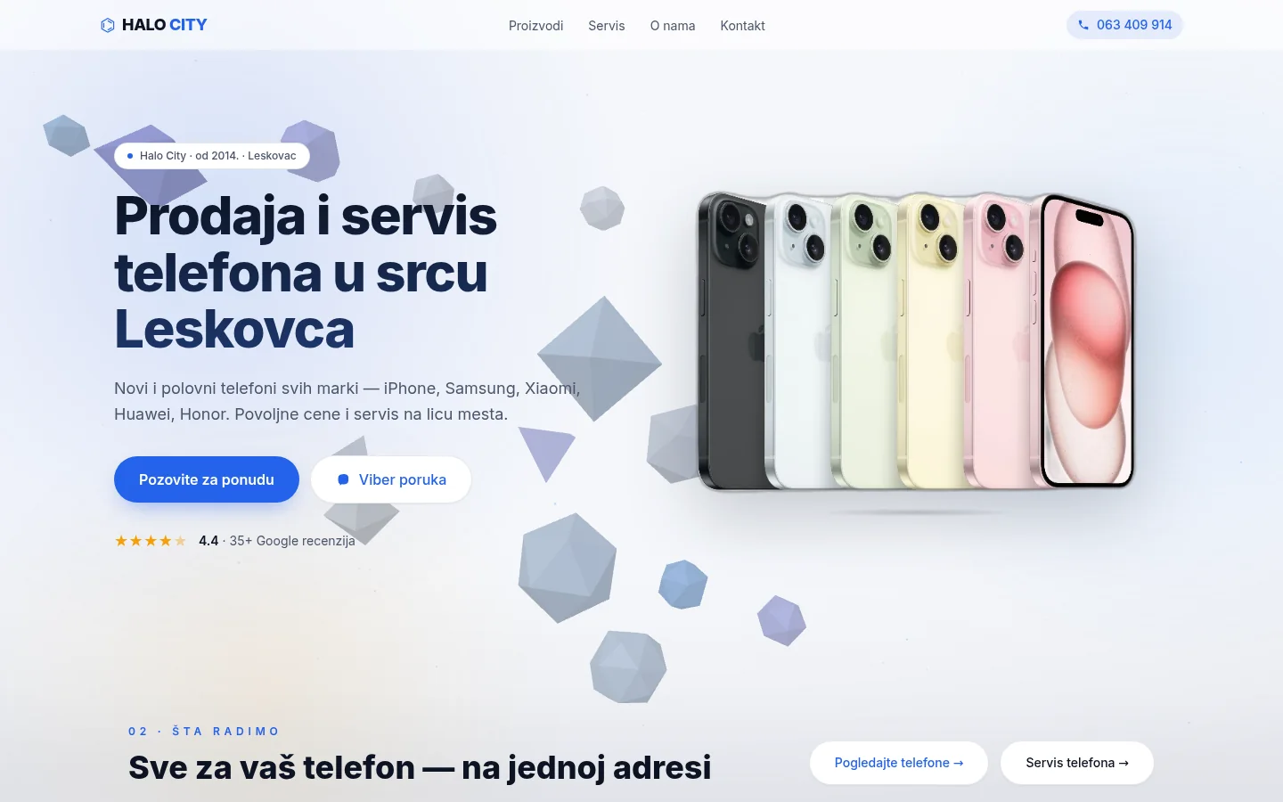
Halo City Leskovac
Mobile phone store and service from Leskovac — five pages in Next.js, live WebGL background and local SEO, without any contact form.
Case study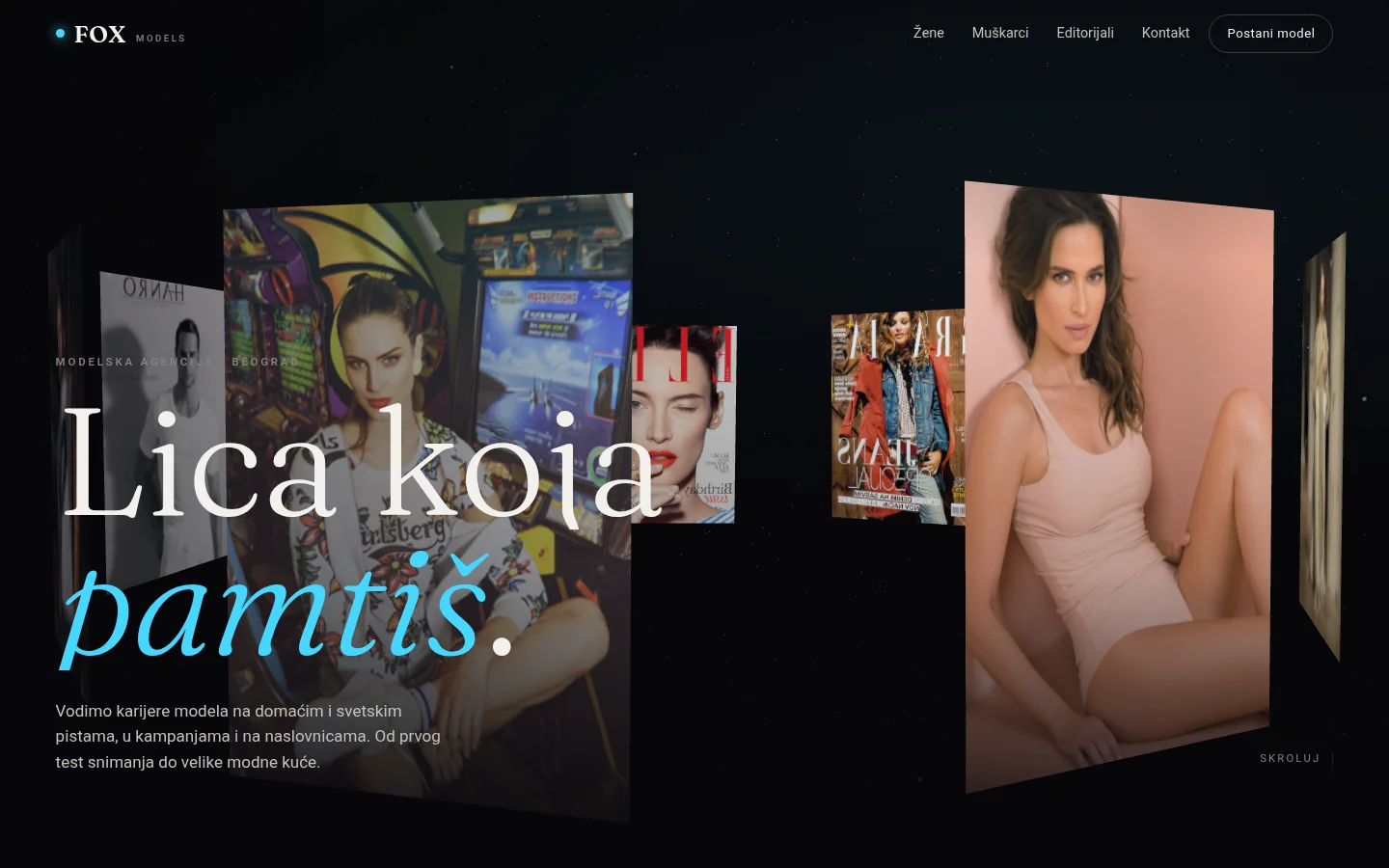
FOX Models
Immersive 3D concept for a modeling agency — ring of photos leading through the scroll, boards, model profiles and application form for new models.
Case studyNext step
Have a project that needs to work better?
Send me your goal and current situation. I will reply with a concrete scope proposal.
Start a project