Website2026-08-21
Diamond Lux — one-page apartment site in the center of Kopaonik
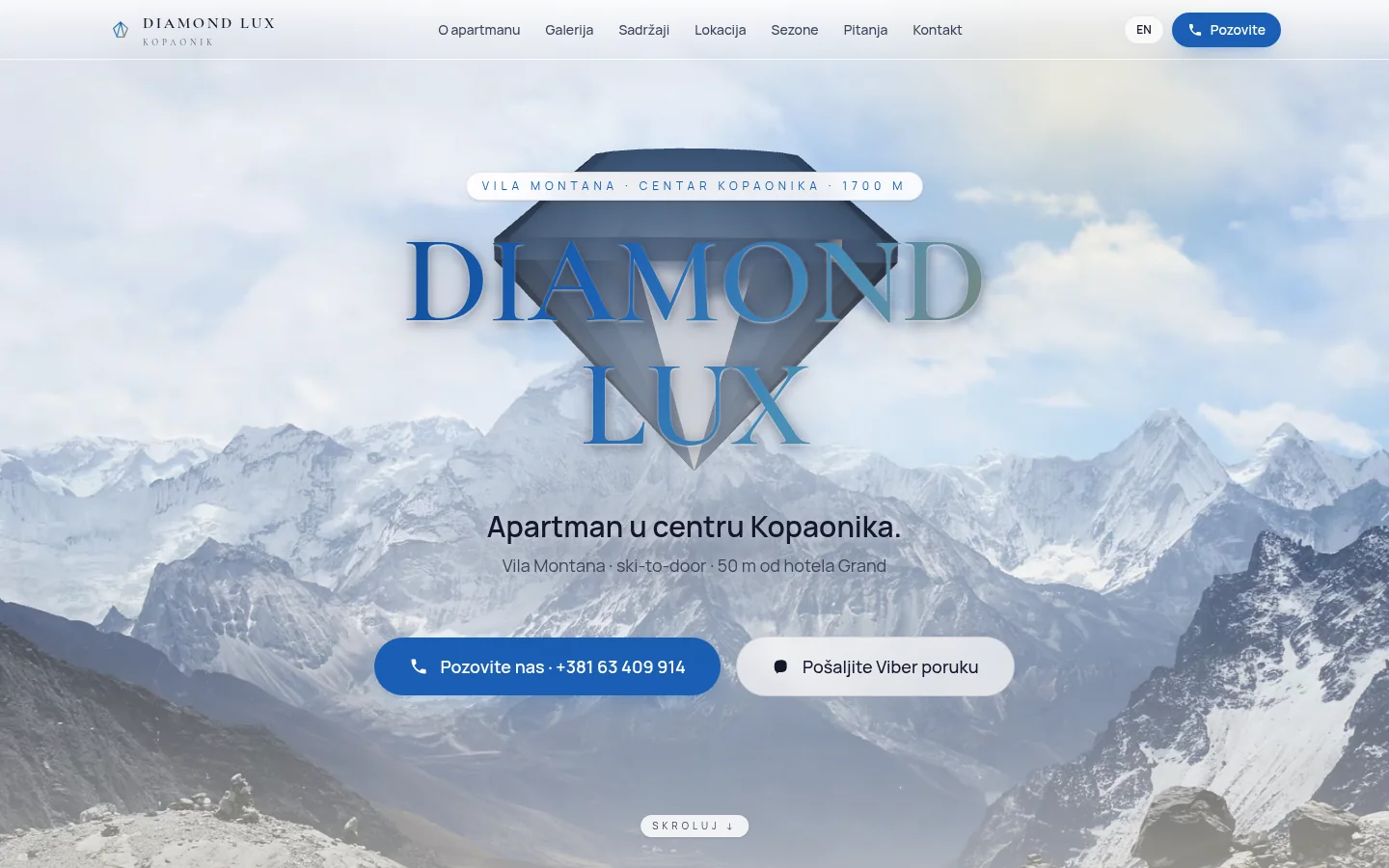
A 33 square meter apartment in Villa Montana, fifty meters from the Grand Hotel. Until now, he lived on third-party listings and on Instagram; he needed his own place on the Internet that convinces the guest in less than a minute and where reservations are made by calling, not by form. One side, Serbian and English, and a three-dimensional scene that follows the scroll from top to bottom.
- Client
- Diamond Lux — Bratislav Rajković
- Activity
- Rental of apartments, private accommodation
- Location
- Vila Montana, center of Kopaonik
- Type
- Single page website in two languages
- Technologies
- Next.js 15 · React Three Fiber · next-intl · Tailwind 4
- Status
- Live site from May 2026
- Technology
- Next.js 15 · React Three Fiber · next-intl · Tailwind 4
Problem and context
What does Diamond Lux do
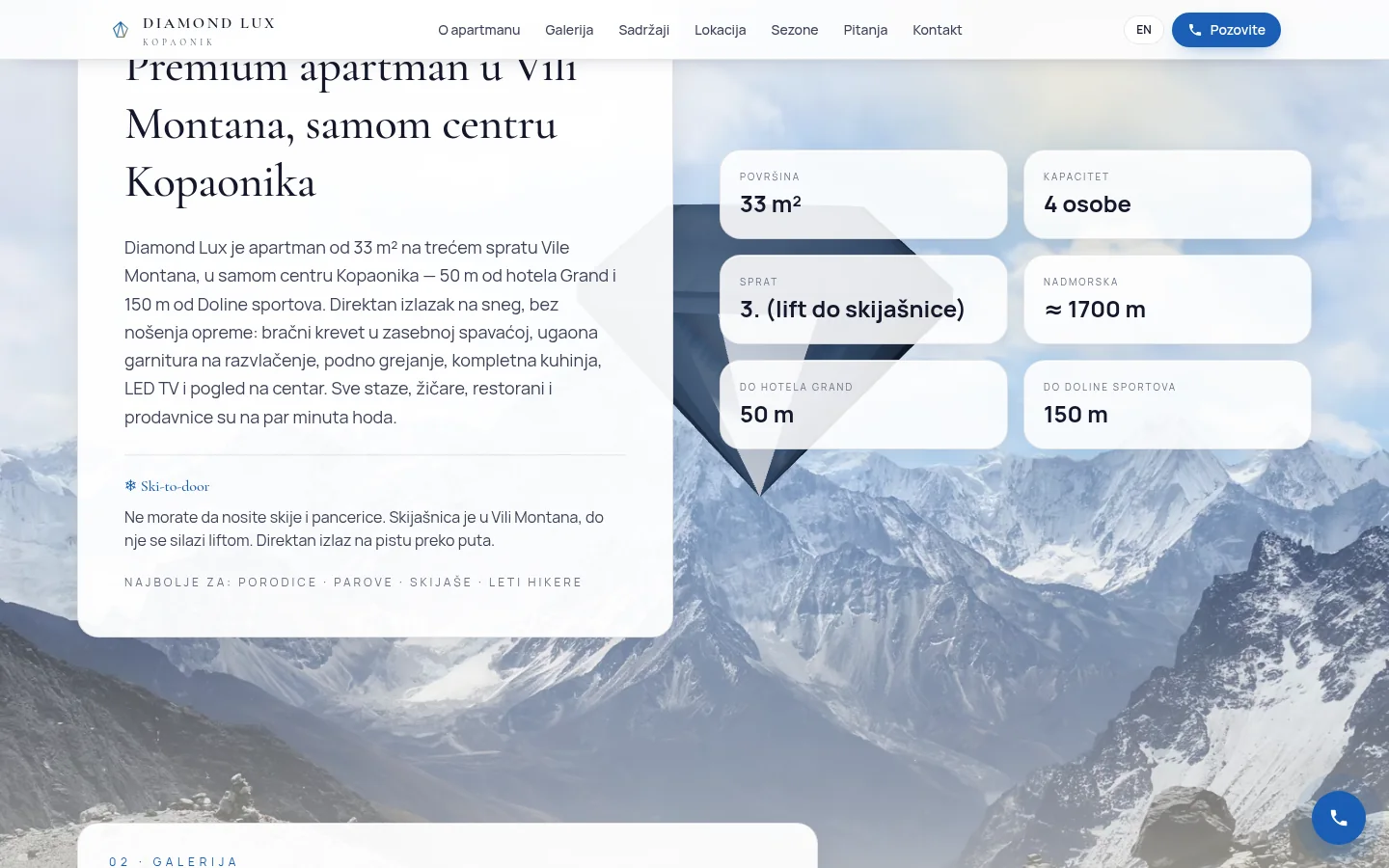
Diamond Lux is a 33 square meter apartment on the third floor of Vila Montana, in the center of Kopaonik. Fifty meters from the Grand Hotel, one hundred and fifty from the Valley of Sports, at about 1700 meters above sea level. It accommodates four guests: a double bed in a separate bedroom and a sofa bed in the living room.
What sets it apart from most private accommodation on the mountain is ski-to-door. The ski room is in the villa itself, you can get to it by elevator, and the exit to the track is across the street. The guest does not carry skis and ski boots through the center, and that is a sentence that sells at Kopaonik more than any other adjective. In addition, there is underfloor heating, a complete kitchen, LED TV with cable, Wi-Fi and parking.
The owner is Bratislav Rajković and he rents directly, without agency and without commission. Until now, the apartment lived on third-party listings, on accommodation portals and on the Instagram account where both of his apartments on Kopaonik are listed.
One thing to be clear right away, because it can be seen in the address: the site is on my subdomain, because the owner does not yet have a dedicated domain. The rest belongs to the owner — the apartment, the photos, the phone numbers and the reservations that go directly to those numbers. When the domain is purchased, the site moves to it, and the old address remains as a permanent redirect.
What needed to be solved
The request was easy to say and awkward to do. The apartment needs a place on the Internet that belongs to it, not a portal, and that convinces the guest before changing his mind. Four hard conditions came out of that:
- Everything on one page. Whoever is looking for accommodation for the weekend does not open subpages. Everything he decides — size, capacity, distance from the track, facilities, location, season and price on request — must fit in one scroll.
- Serbian and English equally. Kopaonik also has a foreign clientele, and the half-translated page is worse than the page only in Serbian.
- Reservation without a form. The owner wants to talk to the guest, not wait for emails. Call and Viber, nothing else.
- Something to remember. Private accommodation on Kopaonik has the same template: gallery, price, form. If a site doesn't differentiate itself, it remains differentiated only by price, and that's the worst place to compete.
Along with that came a condition that no one said, and it goes without saying: the majority of visitors come by phone, often with a bad connection on the mountain. Anything effective must have a backup that works when the effect fails.
One page, seven sections
The site has seven numbered sections and a navigation that jumps to them: About the apartment, Gallery, Contents, Location, Seasons, Questions and Contact. The order is not arbitrary — it follows the order in which the guest makes a decision.
Immediately below the introductory part there is a grid with the most frequently requested facts: area, capacity, floor, altitude, distance to the Grand Hotel and to the Sports Valley. Next to it is a sign for who the apartment is best for — families, couples, skiers and, in summer, mountaineers. It is the place that decides: if the guest does not find his case there, he does not scroll any further.
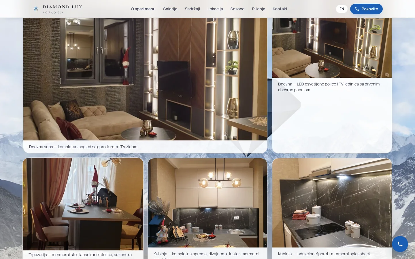
Gallery has ten photos with descriptions for each — living room, dining room, kitchen, bedroom, bathroom, entrance area and view of the center. Each opens in an enlarged view that also works with the keyboard.
The location section isn't just a map. It is accompanied by a small guide through the surroundings in the form of a list: trails and cable cars, restaurants, shops, a place where you can buy a ski pass and a pharmacy, with walking distances. The season section is divided into winter and summer with folding tabs, because the same apartment in July sells hiking, not skiing.
At the end there are eleven questions and answers. They are not there because of the length of the page, but because these are the questions that the owner gets on the phone every time anyway: is there parking, when is check-in and check-out, how long is the ski season, how to get there by car.
Formless reservation
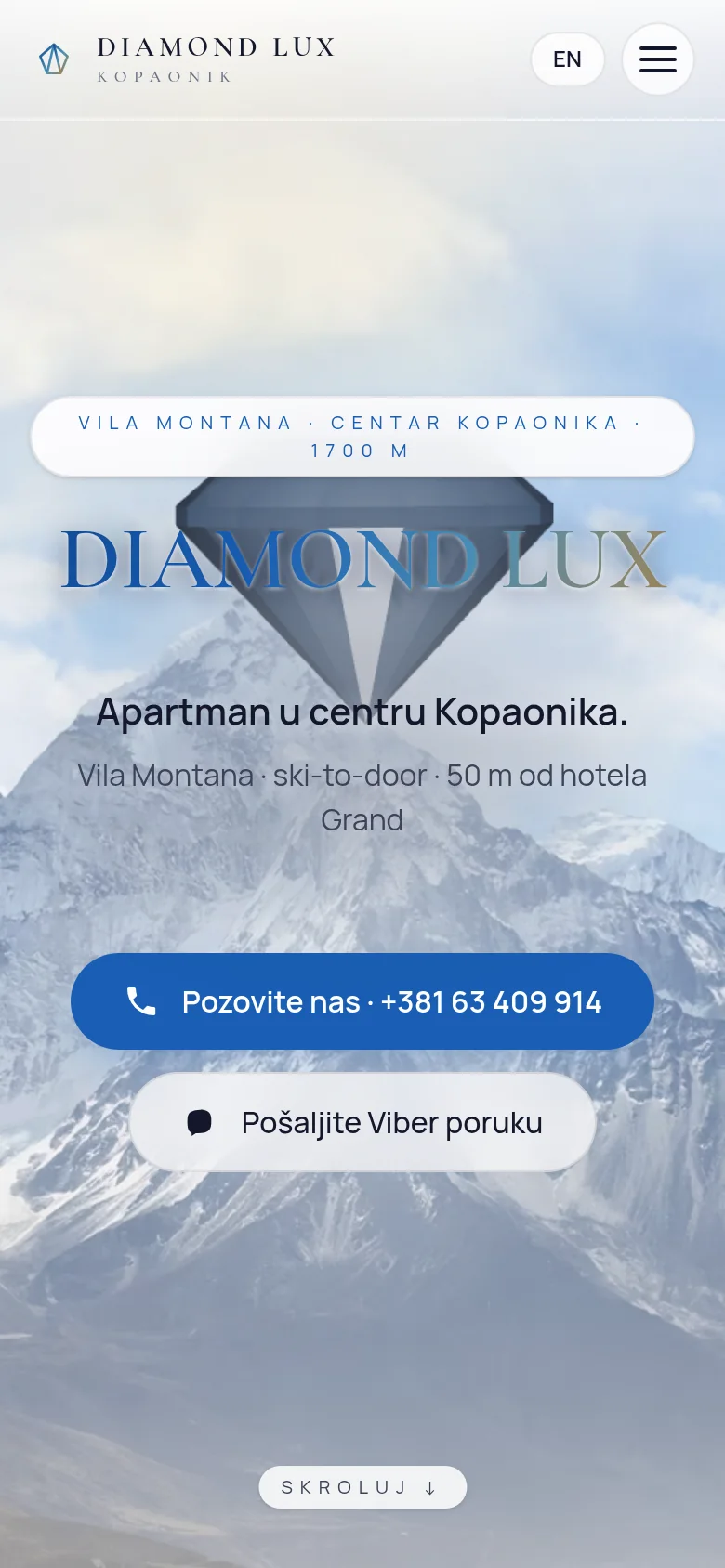
This is a decision that the owner made himself and that shaped the entire site. There is no booking form, no email field, no calendar. There are only two buttons: call and send Viber message.
Viber link is not a bare number — it opens a conversation with an already written first message in which it is written that the visitor is interested in Diamond Lux on Kopaonik. It sounds like a small thing, but it removes the most difficult step: the guest does not have to figure out how to get started. The phone also has a sticky strip at the bottom of the screen with both buttons that follows scrolling and doesn't disappear, so a call is one tap away from anywhere on the page. In the section Contact there are also backup numbers in case the main one does not answer.
The formless site also has a peaceful side that is not advertised: there is no database with other people's data, no messages that get lost in the spam filter and no obligations that come with every data collection. The privacy policy is therefore short and true — the site does not collect personal data through forms, because there are no forms.
It is worth mentioning the price of that decision. There is no trace of an inquiry that did not end with a conversation and no statistics on how many people wrote and then gave up. For one apartment and one owner who answers the phone, that's a reasonable exchange. For ten units and two people who run them, there wouldn't be, and then this site would look different.
Diamond leading through the scroll
The name of the apartment also gave an idea. Across the page, behind the content, floats a diamond made in WebGL that follows the scroll: it slides to the side, descends, slips into depth, and shrinks as it goes to the bottom. Snow falls around him, and the scene moves slightly with the mouse pointer.
The stone is not a finished model taken off the web. The geometry is written in code like a true brilliant cut—table, crown, rondista, and pavilion to calette—and is intentionally unindexed, meaning that each triangle has its own points. Because of this, the normals are calculated per side, not per point, so the facet looks sharp and flat instead of melting into a smooth ball. It's the difference between a stone and a glass ball.
The material is transparent, with a refractive index of 2.42 like a real diamond and a slight chromatic aberration that breaks the light into colors along the edges. No image post-processing — no blur or shine across the entire scene. That's intentional: post-processing is the most expensive part and the most common cause of crashes on weaker phones, and the gain on this stage wouldn't be worth the risk.
The most interesting problem in the whole scene was a banal one. A transparent stone on a light background is invisible — it breaks white into white and remains an invisible outline. The site has a warm, almost creamy background, so the diamond just disappeared. The solution is a dark circular plate behind the stone, like a reflector turned upside down: it gives the facets contrast, and fades with the scroll so as not to stain the bright theme of the page.
Errors that ruined the page
This part is here because it was the most expensive. At one point, the site showed the visitor an error message instead of the page, and not to everyone, so it was reported as "sometimes not working".
There were three causes and each one is sufficient in itself. The first: when the browser does not have WebGL — the graphics layer is turned off, the older phone — the library for three-dimensional display throws an error, and without a protective component above it, the whole page falls, not just the scene. Second: finished lighting from the library pulls the file from the network from someone else's server, which the site's security rules prohibit, so the rejected request also crashes the display. The third: there was incorrect HTML in the gallery — a button inside a button — which the browser rewrites itself, so the rewritten structure differs from the one the server sent.
It is solved in order. Lighting is now done in code, from several light sources placed manually, without any external requests. Above the scene stands a protective component that catches the error and quietly returns a static photo of the mountain. The library itself is loaded only after WebGL is confirmed to exist, in a separate package, so the first page load remains at 136 kilobytes regardless of whether the scene starts at all. Whoever turned off the animations in the settings does not get either the scene or the snow.
There was also a visual glitch that sounded like a minor thing: a dark blue bar would pop out at the bottom when scrolling. The cause was the dark mode of the operating system — the page also had a dark palette that turned on automatically, and the background photo moved when scrolling and left a gap through which the palette was visible. The theme is locked to the light, the dark blocks have been erased, and the background has become a stationary full-screen layer. A gap cannot arise because nothing moves.
Serbian and English as two equal sites
The Serbian version is at the root of the address, English at /en, and the browser is clearly told which is which and that there is a choice. The privacy policy has both versions and they recognize each other, so a visitor in English does not end up with a Serbian legal text.
The translation was also the place where the quiet problem was found. The English version appeared to be translated, but it still had Serbian written in five places: the Distance title in the location, the opening paragraph above the question, the winter and summer card names with tips below them, the labels for the gallery buttons that screen readers pronounce, and the primary and backup contact labels. Those texts did not go through translation files, but were written directly into the components, so no one even saw them as untranslated.
They were all transferred to translation files, and the check was rough and efficient: a search of the English HTML for Serbian letters and words returned zero. The lesson that is transferred to every bilingual site — the translation is not finished when the texts are translated, but when there are no written words left in the components.
Performance and what is really measured
Photos of apartments are the most difficult part of the page, so they are served in modern formats and in several sizes, and the browser takes the one that suits him. The opening photo of the mountain is both the largest element of the first image and a backup variant for the scene, so it is loaded first and without delay.
The latest measurement in Google Search Console gives desktop 100 for performance, accessibility, best practices and SEO, with the largest element rendered in 0.7 seconds. On the phone, accessibility, good practice and SEO are also 100, and performance 89, with the largest element at 3.5 seconds. Layout shift when loading is zero on both devices — nothing jumps under your finger.
The number 89 stands there on purpose and will not pretend to be a hundred. A three-dimensional scene costs money, and the decision was that the visual impression is worth the difference on a site whose job is to be remembered. Everything that could be paid for without losing the impression — delayed library loading, omitted post-processing, quality adjustment for a weaker device — has already been paid for.
Both language versions pass W3C verification without a single error. The season tabs work according to the keyboard rules, the enlarged image view has captions for screen readers, and the skip link at the top leads to the main content.
SEO, structured data and visibility
The title and description are written separately for each language and shortened to the length that the browser actually displays — the Serbian title is 52 characters, English 54, descriptions about 155. The primary phrase is at the beginning, and the distance from the Grand Hotel is in the description, because that's the information that gets clicks.
The main title of the page remained the DIAMOND LUX logo, which is a design decision that has not changed. Key phrases therefore have a subtitle below it and the title of the section about the apartment, which literally says that it is about the apartment in Villa Montana, in the center of Kopaonik.
Structured data is a serious piece of work: one connected graph with eighteen types, including Apartment with area, number of rooms and capacity, LodgingBusiness with contact, FAQPage, description of surrounding locations and data for voice search.
One detail is worth more than the rest. The questions and answers have grown from five to eleven, and the FAQPage data is generated from the same translation files from which the visible text is printed. The most common mistake with structured data is to change the text on the page and keep the old one in the data — this is not possible here, because there is only one source.
Artificial intelligence robots have explicit permission in robots.txt, the sitemap contains language pairs for each address, and new versions are reported to search engines via the IndexNow key.
Honest about visibility: when the address was changed from the old subdomain to diamondlux, Google crawled the new address while the content was identical to the old one and declared the old one as the main one — the new site looked like a duplicate to it. It was solved with a one-step permanent redirect, a manual re-visit request, and a separate entry in Search Console. Ranking on the subdomain according to the booking portals is still a long race, and the strongest remaining leverage is not technical but the owner's: profile on Google maps, link in Instagram biography and existing ads that lead to the site.
Map, cookies and small details that are easy to miss
The map in the location section didn't work, and it wasn't visible from the side — there was just a gap in that place. Cause: the map was loaded from Google, and server security rules only allow frames to be loaded from OpenStreetMap, so the browser was silently rejecting the frame and reporting the violation only in the console. It has been replaced by an OpenStreetMap map that respects the rules and does not follow the visitor, while the link to Google navigation has remained as an ordinary button, for those planning a trip by car.
Security headers were set twice — once from the application, once from the server — so some arrived in duplicate. The server was declared as the only source, and the set remained full: forced HTTPS, prohibition of inserting the site into someone else's frame, locked camera and microphone, and strict rules about where content can be uploaded. Along with this comes security.txt and its own page for non-existent addresses, in both languages.
Cookies work according to the rule that nothing is measured until the visitor agrees. The bar offers three choices — all, only necessary and settings — and the analytics record anonymously and only turn on after consent.
The most hidden error was in the DNS record. The site had a published IPv6 address that the server didn't own, inherited from an old deployment note, so a visitor coming over an IPv6 network waited until the connection timed out. With IPv4, everything worked, so the failure did not show up in any simple check. It was corrected on all addresses from the same group and verified by calling exactly over IPv6. You can see the details of the legal part in the privacy policy, which is short because the site has nothing to collect.
Outcome
What the client received
An address that is his, in two languages, that he can put in his Instagram biography, in an ad on the portal or is dictated by phone. The guest from that address calls or writes in one touch, and the conversation ends with the owner, not with the intermediary who takes a percentage.
The site has no monthly platform subscription, no plugins that break on the next update, and no leaky database. The code sits on the server, can be copied and moved — including moving to its own domain when the opportunity arises.
In the footer there is also a link to another apartment of the same owner on Kopaonik, with a return link from that side, so the two sites work for each other instead of competing.
What is left for the owner, is left because no one else can do it for him: a profile on Google Maps for the apartment, a link to the site in the bio of the account and on existing ads. Everything technical is done and checked — on the computer and on the phone, in both languages, with the three-dimensional scene on and off.
FAQ
Frequently asked questions
Why one page and not a multi-page site?
Because one apartment is described once. Who is looking for accommodation for the weekend does not open subpages but scrolls until he finds a reason to call or a reason to leave. Everything he decides is in one scroll, and the navigation at the top jumps to the section he is interested in.
Why is there no booking form?
Because that's how the owner works — he answers the phone and arranges live. The site therefore offers a call and a Viber message with an already written introduction, and on the phone those two buttons are in the bar that follows the scroll. Without a form, there is no database with other people's data or an inquiry that gets lost in the spam filter.
Does the three-dimensional scene slow down the site on the phone?
It costs, and it shows in the measurement: on the phone, the performance is 89 instead of 100. The library is loaded only after it is confirmed that the device supports WebGL, in a separate package, so the first loading of the page does not depend on the scene. The decision was that the visual impression was worth the difference.
What does a visitor whose phone doesn't support 3D view see?
A static photo of a mountain and the entire page content, without a single error message. The same applies to a visitor who has turned off animations in the settings. The scene is an addition, never a requirement for the page to be seen.
Why is the site on a subdomain and can it switch to its own domain?
Because the owner does not have his own domain for now. The transition is simple: the site is transferred to the new address, and the old one remains as a permanent redirection so that the existing links are not lost. The only condition is to request a second visit after that, because the search engine does not notice the change of address immediately.
How long does it take to create a site like this for an apartment?
The site itself is less than expected, because it is one page. Photos, texts in both languages and checking on the right devices take the most time. If a three-dimensional scene is being created, it is a separate job and you need to count on a few extra days with it.
Up next
Related projects
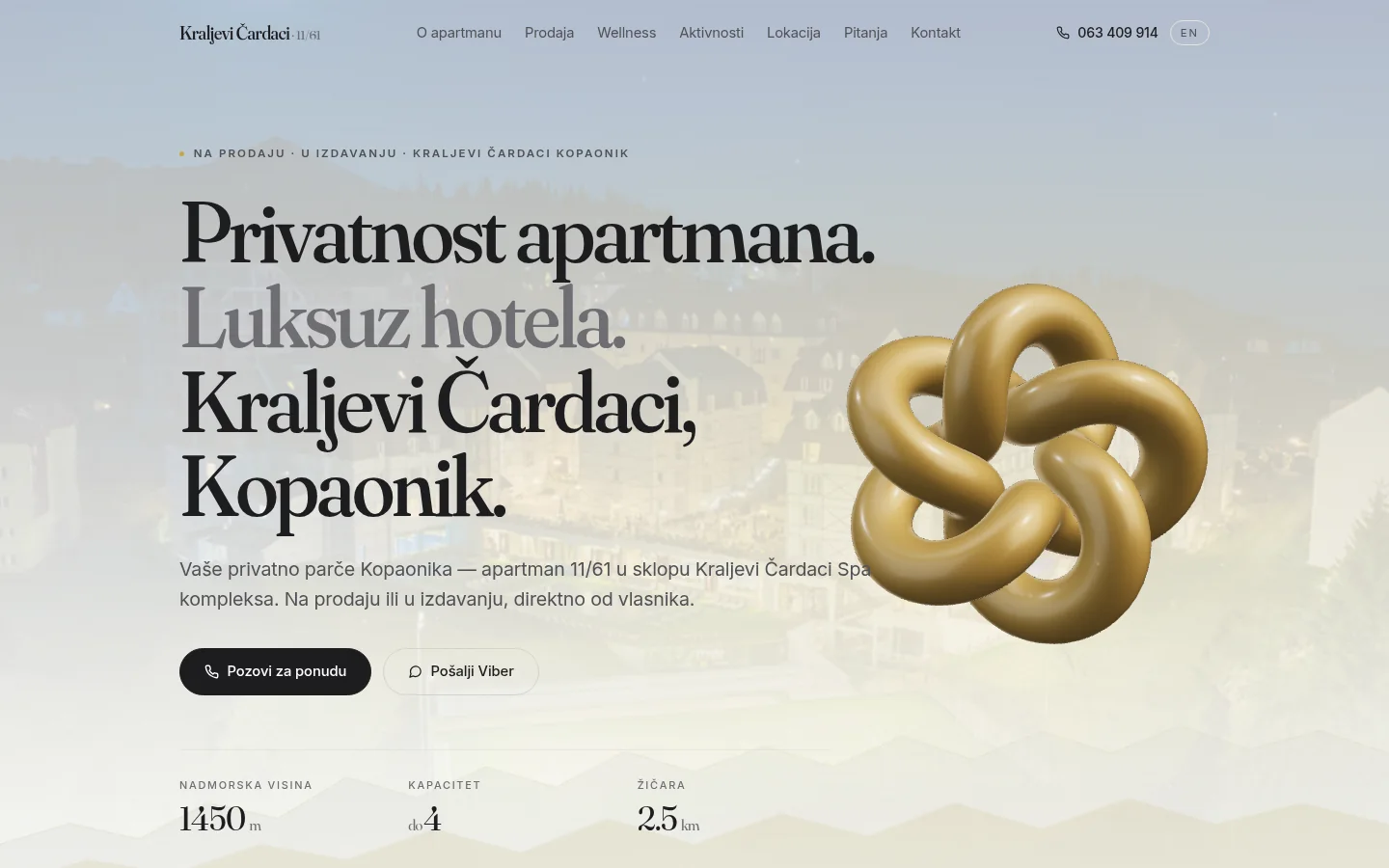
Apartman 11/61 — Kraljevi Čardaci
One page for an apartment on Kopaonik that is sold and rented at the same time — in Serbian and in English, with a 3D scene that only works on the desktop.
Case study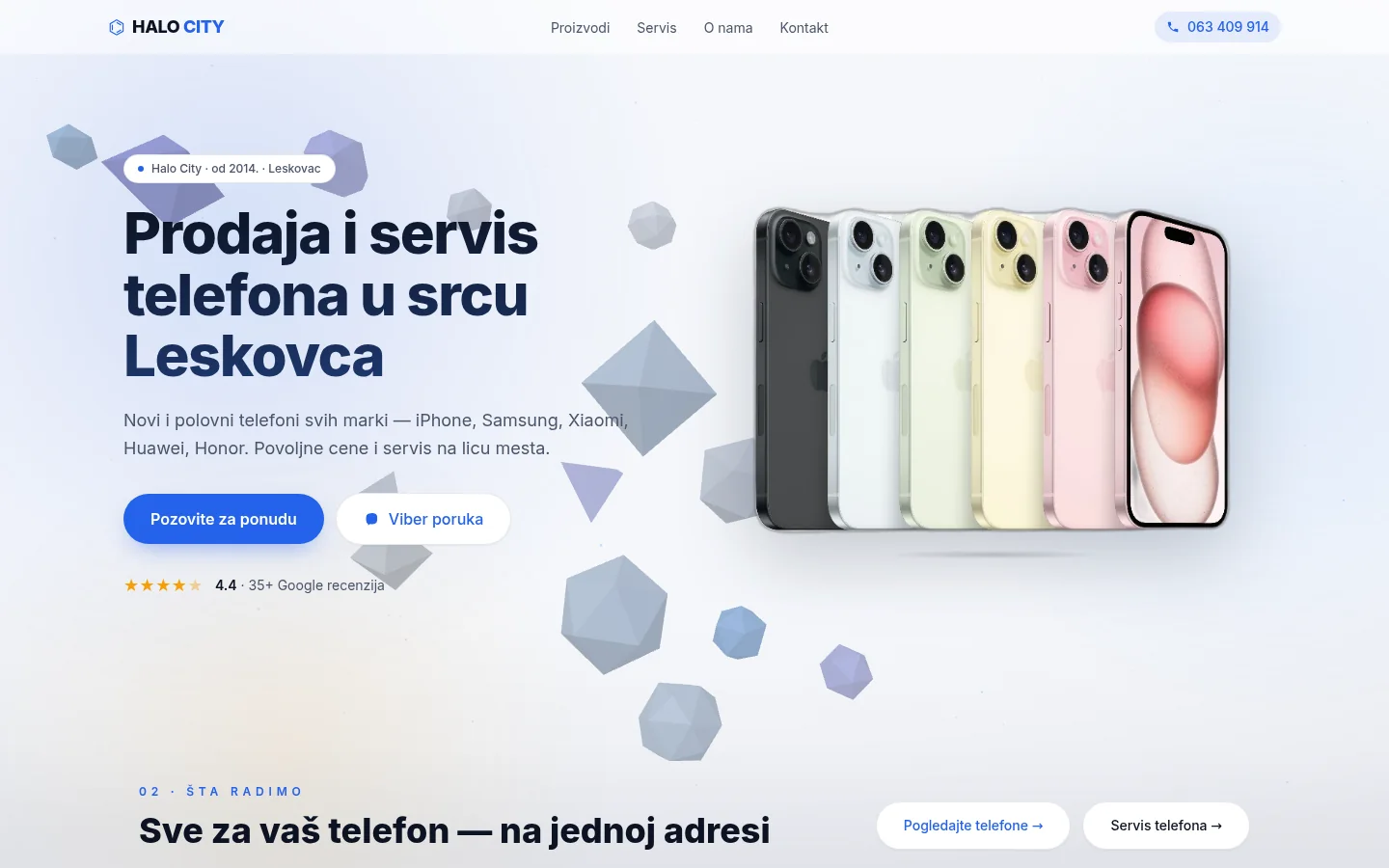
Halo City Leskovac
Mobile phone store and service from Leskovac — five pages in Next.js, live WebGL background and local SEO, without any contact form.
Case study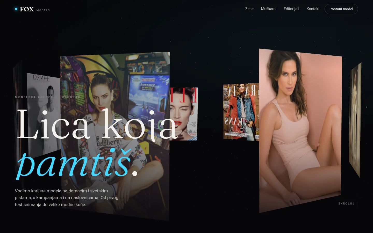
FOX Models
Immersive 3D concept for a modeling agency — ring of photos leading through the scroll, boards, model profiles and application form for new models.
Case studyNext step
Have a project that needs to work better?
Send me your goal and current situation. I will reply with a concrete scope proposal.
Start a project