Website2026-08-21
Halo City Leskovac — phone sales and repair on a dedicated website
A shop of three people in the center of Leskovac that has been selling and repairing phones for twelve years, and it was practically not found in the search. She needed five pages that cover what people actually type, a one-touch invitation instead of a contact form, and a visual level that doesn't look cheaper than the competition with a real domain.

- Client
- Halo City Leskovac
- Activity
- Sales and service of mobile phones
- Area
- Leskovac and Jablanički district
- Type
- Multi-page site with 3D background
- Technologies
- Next.js 15 · React 19 · three.js · Tailwind 4
- Status
- Live since May 2026, on my subdomain
- Technology
- Next.js 15 · React 19 · three.js (WebGL) · Tailwind 4 · TypeScript
Problem and context
What Halo City does
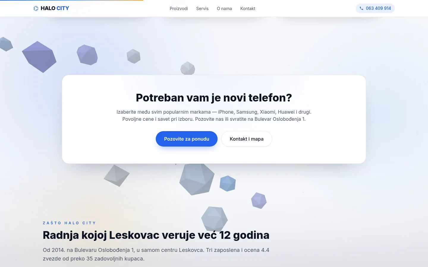
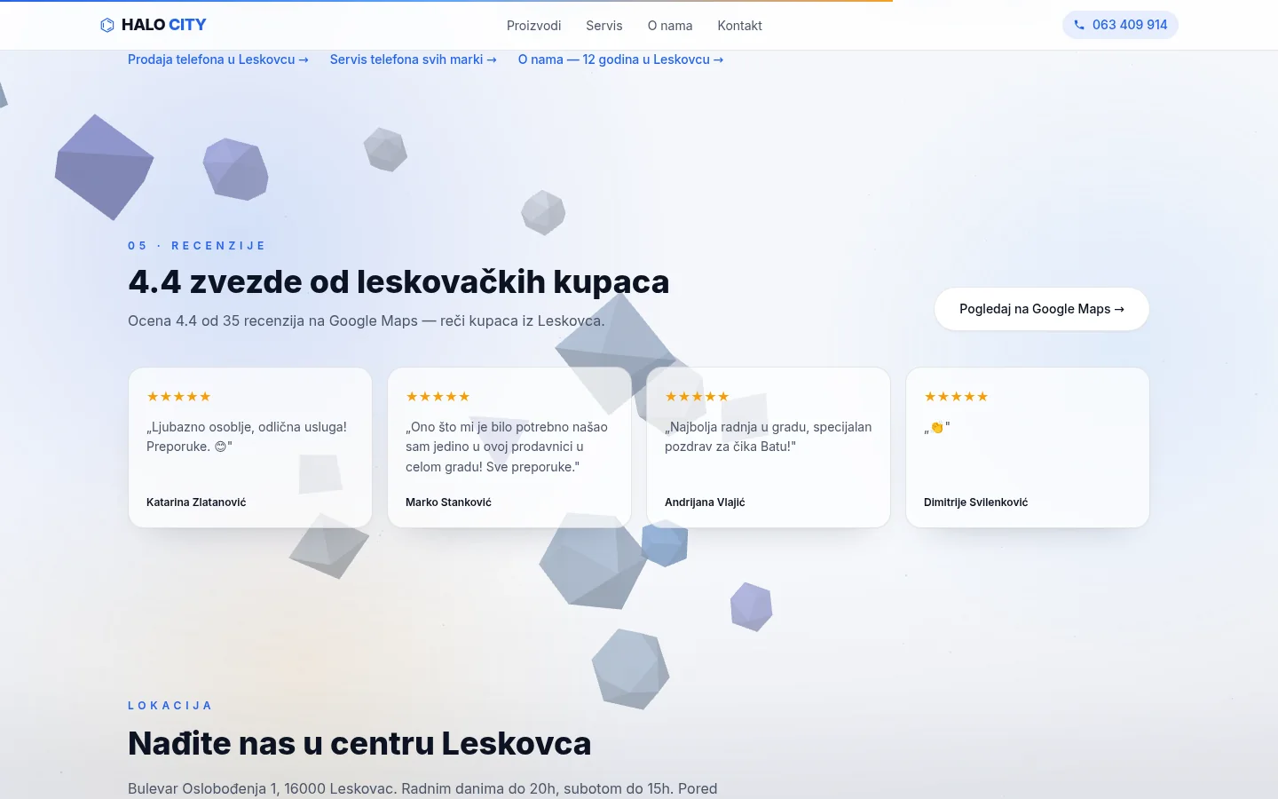
Halo City Leskovac is a mobile store and service telephone on Oslobođenja Boulevard 1, in the very center of Leskovac. The store has been operating since August 2014, has three employees, and has a 4.4 rating on Google Maps out of over thirty-five reviews.
Business stands on two legs. The first is sales — new phones of popular brands (iPhone, Samsung, Xiaomi, Huawei, Honor, OPPO), verified used devices and equipment: masks, protective glasses, chargers, cables, headphones, holders. The second is service — screen and battery replacement, charging connector, liquid and moisture, software and system, camera and speaker, all the way to micro-soldering on the motherboard when the phone no longer shows signs of life.
Customers do not only come from Leskovac. Vlasotince, Lebane, Vladičin Han, Bojnik and Medveđa gravitate to the city — places from which you can travel to the nearest larger center with a broken phone. This is also the reason why the site means such an operation at all: the person whose screen cracked first asks the search, not the neighbor. If the action is not in the results, it does not exist for that man either.
Everything the store offers was already there — twelve years of work, ratings, regular customers and an address in the center. The only thing missing was an website.
Why the site uses my subdomain
One ownership detail needs to be clear. halocity.svilenkovic.rs is my subdomain, not the client's domain. The shop is real, the site has been live since May 2026, but the business does not yet have its own domain — so the site is on my infrastructure, on the host that bears the shop's name.
It is not a parked page waiting for something. The site has its own HTTPS certificate that automatically renews, its own sitemap and robots.txt, its own analytics with consent to cookies, its own record in Google Search Console and in Bing Webmaster Tools, and its own IndexNow key to report changes to search engines. It works like any other site, but uses a subdomain address.
The trade-off appears in local search visibility. A dedicated domain containing the company name has a better starting position for queries like "telephone service Leskovac" than a subdomain, and it is fair to say that instead of pretending that there is no difference.
The move has been prepared and rehearsed once. The site was moved from the old working host to the current one in July 2026, and then the old URL received a permanent redirect in one hop, with the path preserved — /service went to /service, not home. The same procedure is ready for a dedicated domain when it is available: DNS record, certificate, updated canonical URLs, 301 from subdomain. It's half a day's work, not a new site.
What needed to be solved
The task was not "make a shop site" but four specific things:
- Find yourself in a search for two different jobs. A customer buying a phone and someone with a cracked screen are not the same visitor and they are not typing the same thing. One page cannot be first for both queries.
- One touch call. The owner and two employees stand at the counter all day. A contact form that no one opens is worse than not having one.
- Looking serious. There is already a competitor in town with the right domain and longer experience on the internet. A three-person shop cannot outscale that competitor, so its site must compete through clarity and presentation.
- Do not promise a price that changes. The price of the screen depends on the model and the exchange rate. An outdated figure on a website is worse than no number at all.
In addition to this, there was a condition that is easy to overlook: the site must work on a phone with a weak connection, because it is most often opened by someone whose device is broken and who is sitting on the bus. All decisions about speed and how much performance budget the 3D scene could use were derived from that one sentence.

Five pages instead of one long one
The first version was one long page with all the sections, as is usually done for small companies. It soon became clear that this did not solve the first point of the task. One page has one title, one description, and one main term — and with that term, it competes for either sales or service, never both.
The site is therefore broken into five pages, each with its own title, description, canonical URL and its own image to share:
- Home — what the store does, why it's trusted, reviews and location.
- Products — new phones, used devices and equipment, tape with brands and questions that customers ask when buying.
- Service — eight types of repairs, a four-step service flow and the most frequently asked questions about repairs.
- About us — twelve years of work, three pillars of work and a timeline since 2014.
- Contact — address, both numbers, working hours and map.
The subpages have the city in the title of the first line: "Mobile phone sales in Leskovac", "Mobile phone service in Leskovac". It sounds like a small thing, but it's the difference between a side that competes for the concept of a city and a side that competes with the whole of Serbia.
Pages do not end blindly. From service, the sentence leads to sales, from sales to service, and from the About page to all three. A visitor who came for repairs learns that a new phone is also being bought in the same store, which was the main reason to push the sale forward.
Call and Viber instead of the contact form
There is no contact form on the entire site. It was a decision, not an omission.
The form on the website of a small shop works like this: the visitor writes a message, the message falls into a mailbox that is opened in the evening or never, and the person calls someone else in the meantime. The phone rings immediately. The Viber message arrives immediately. That's why there are only those two times on the site, and that on every screen.
The number in the header is an active link that opens an invitation on the phone. The button for Viber opens a conversation with a pre-written message — on the homepage it says that the visitor is interested in buying a new phone, on the service page that it needs repair. The owner gets a message that already says what it's about, instead of an empty "hello".
Contact page is the rest: address, mobile and landline number, working hours by day with clearly written "closed on Sundays", and a map. The map is a different story — in an earlier version, it stood with a filter over it, so it looked like a broken image; it has been replaced by a plain inline view without any effect, with the appropriate rule on the server allowing that view at all.
The side benefit of a decision without a form is legal. The site does not collect personal data through the web, so the privacy policy can be short and true instead of long and rewritten.
The price list that was intentionally removed
The site once had an entire service price list with amounts in dinars. He was thrown out completely and it was a good decision.
The price of replacing the screen depends on the model, on whether it is an original or a checked part, and on the purchase price that is being changed. A price list on a website that does not follow the store creates two problems: the customer who comes with a printed number in his head, and the store that has to explain why the number is no longer valid.
Instead of an amount, the site promises a mechanism. Diagnostics is free and without obligation. The price is given before the repair. The repair starts only when the customer approves it. It is paid after the work is completed. These are four sentences that never get old and can be fulfilled every day.
The same principle was applied when the job changed. The site had an entire page on buying used phones; when the focus shifted to sales and service, the page was removed along with every mention of redemption in the menu, descriptions, structured data, and sitemap — and the old address was redirected to sales, so that no remembered or indexed links end up empty. The site follows the plot, not the other way around.
Keeping the 3D background and replacing the phone renders
This part involved the most experimentation and the most discarded work.
The idea from the beginning was for the site to have an animated three-dimensional background — something that immediately says that this is not a template bought for twenty euros. The first serious version went a step further: the phone was modeled in Blender from a script, exported as a .glb model of about a hundred kilobytes without any external decoder, then multiplied into a fan arrangement of five devices in different colors standing in the hero. A photorealistic background with three phones is also rendered from the same model.
On screen, it looked artificial. The execution was competent, but the result was unconvincing. A stylized phone in a game and a product image on a retailer’s website serve different purposes: the customer knows what a real iPhone looks like and immediately sees that he is looking at a model. That entire layer was deleted the same day, along with the model, the render, and the script that makes them.
The replacement is a single real photo of the phone lineup with no background, cropped with the background remover tool and compressed into a 46 kilobyte WebP. The result is better than anything modeled before, and it weighs as much as an icon.
The three-dimensional layer survived, but changed its role — from the focal point to a supporting background. Today it's a WebGL scene with sixteen pale, faceted crystals floating gently in the depths, along with about five hundred dust dots and an exponential fog that blends the distance with the light background. The camera moves after the mouse and after the scroll, both movements are very soft, so that the sense of depth is noticed and the motion never becomes distracting.
On the phone, the scene reduces its workload: nine crystals instead of sixteen, less dust, anti-aliasing turned off, and a lower upper threshold for pixel density. Underneath it all is a CSS layer with soft colored blobs, grain, and vignette — it's server-rendered and is there before any script is executed, so the page is never blank.
The phone brands displayed as logos are also local — the six brand marks are stored as local files on the server instead of being pulled from someone else's network. That removes one external dependency that could fail or change.
Performance — so 3D doesn't cost the first screen
A live 3D background is the most expensive thing a small shop website can carry. The whole performance is therefore subject to one rule: nothing of 3D must happen before the visitor sees the content.
The library is not imported into the main package, but is loaded afterwards. Its launch waits for the page to load completely, then half a second, then the first moment when the browser is idle. Until then, the background is covered by a CSS layer that costs nothing. Measuring before and after that change: the mobile score went from 88 to 92, and the time the main thread was blocked dropped from 380 to 250 milliseconds.
Further measures go in the same direction. The scene pauses when the card is not in the foreground, so the phone in the pocket does not draw anything. The pixel density is limited from above, because a scene of sixteen shapes gets nothing from triple the resolution and consumes triple. When a component is removed, all geometries, materials, and the renderer itself are neatly freed — a WebGL scene that doesn't clean up is a memory leak that only becomes apparent after a dozen page transitions.
Two exits lead completely out of 3D. If the visitor in the system has reduced animations turned on, the scene doesn't start at all — and neither does the smooth scrolling. If the browser is unable to create a WebGL context, the error is caught and everything remains on the CSS background, without a single message in the console and without an empty rectangle.
The same caution applies to the rest. The hero image loads immediately and with high priority because it is what the visitor sees first. Sections appear on scroll via the section viewer, which dismisses each element as soon as it is displayed; if the observer is not available, everything is displayed immediately. And just in case JavaScript doesn't work at all, there is a rule in the header that cancels both the introduction screen and the hiding of sections — the content is visible, without animations.
One measurement pitfall is worth mentioning, as it is repeated on every site with a gradient title. The main title is colored with a gradient through the text, which technically makes it transparent — and the automatic test therefore doesn't count it as the largest element on the screen. On text pages, the candidate becomes a cookie bar instead, which appears after loading, and displays the lab result for five seconds. An independent measurement in a real browser gives a little over one second. The number from the lab is an artifact here, not a bug, and is treated as such.
SEO and local visibility
All pages went through a process in which the titles were shortened to the length that the browser actually displays, the descriptions were reduced to less than one hundred and sixty characters, and the first lines of the subpages were given the name of the city. The title of the homepage has been shortened from ninety-two characters to fifty-eight and begins with a term, not the name of the company.
Structured data is the biggest part of local business. The site has a connected graph in which are the type of mobile phone store, the organization, the site itself and breadcrumb navigation, along with the address with postal code, geographical coordinates, working hours per day, rating with the number of reviews, date of establishment and number of employees. The area covered by the shop is specifically listed — Leskovac, Vlasotince, Vladičin Han, Lebane, Bojnik, Medveđa and the entire district.
One thing had to be corrected. The block with frequently asked questions was placed at the level of the entire site, so it was reported to the search engine even on pages where there are no questions at all. It has been switched to broadcast only on sales and service, where those issues are actually on the screen. Data that promises what the visitor does not see is a mistake that will sooner or later be charged.
Added to this are hyper-local headers that are rarely posted: region designation, coordinates, place name and contact information in a form readable by social media. The robots.txt file explicitly allows artificial intelligence bots as well, as more and more answers today are given in a conversation with an assistant instead of in a list of results. The sitemap has six URLs and is reported in both browsers, and changes are additionally pushed through IndexNow.
Moving to today's host also brought an instructive problem. The search engine visited the new host the same day it was released, while the content was identical to the old one — and declared the old address canonical. The new site was thus organized, indexed and invisible at the same time for some time. The solution was a permanent redirection of the old URLs, a manual request to revisit and patience; the technique was correct all along, you just had to tell the search engine which address was the right one. After that pass, all pages score 100 on the technical part of the audit and pass the code correctness check without a single error.
Analytics that respects the answer
The site measures the visit, but only when the visitor allows it. The cookie bar offers three responses—accept, necessary only, and settings—and analytics is preset to denied and awaiting a decision. Functional cookies always work, because without them the site could not be displayed correctly.
That setting had a silent bug for a while that's worth mentioning because it doesn't show up in any tests. The tape recorded the consent under one name, and the part that turns on the analytics was read under another. The first time, everything worked — the visitor clicks, the measurement starts. But the returner who has already accepted does not get a tape, so the measurement never started for him. The result was a statistic that systematically loses those who return, therefore the most valuable part of the visit. The fix was a single code word; finding it was all work.
The privacy policy was written for this site, not rewritten: it says what is collected (anonymous visit statistics and only after consent), what is not collected (no data through the form, because there is no form), and what the visitor can ask for.
Outcome
What the store received
A website that works without care. The site sits on the server as a standalone application behind the server that publishes it, with a self-renewing certificate and a full set of security headers. No plugins that break on the next update, no monthly platform subscriptions, no panel that someone has to log into to keep the site running.
Practically, the day looks like this: someone from Vlasoticin searches for a place to change the screen, finds a service page, reads that diagnostics are free and that the price is stated in advance, presses the number and calls. There is no form, no waiting for an answer, no steps in between.
There remains one thing that does not depend on the code: the real address. The store has a profile on Google Maps with a rating and reviews, and that profile is the most powerful lever a local business has — when this address is entered in the site field, both parties start working for each other. When the store takes its own domain, the transition is prepared in advance.
Until then, the site does what it was created for: twelve years of work behind the counter finally has a place to be seen, on the page that opens immediately and on the weakest connection.
FAQ
Frequently asked questions
Why is the site on a subdomain and not on its own domain?
Because the store does not yet have its own domain, and the site should have been launched. A subdomain has everything a real domain has — certificate, sitemap, analytics, record in search engine tools. The only difference is a weaker starting position for local queries. Switching to the right domain is changing DNS records, certificates and canonical URLs with permanent redirection, not creating a new site.
Why is there no contact form on the site?
Because in a shop with three people behind the counter, no one monitors the mailboxes during the day. A message from the form of a check, the phone rings immediately. Instead of a form, on each screen there is a number that can be opened in the invitation and Viber with a pre-written message, different for purchase and for service.
Why is there no service price on the website?
Because the price depends on the model and the purchase price of the parts, so the price list on the website becomes outdated faster than it is updated. Instead of an amount, the site promises a procedure: the diagnosis is free, the price is stated before the repair, the repair starts only after approval. That's a promise that can be fulfilled every day.
Does 3D background slow down a site on an older phone?
No, and that was a requirement. The three-dimensional layer is not loaded until the page is fully displayed, on the phone it reduces itself to smaller shapes and a lower resolution, it pauses when the card is not in the foreground, and it turns off completely if animation reduction is enabled in the system or if the browser does not support WebGL. In that case, the background is carried by a simple CSS layer.
Why Next.js and not WordPress?
Because of the speed and because there is nothing to maintain. Sides are served pre-made, without a database or add-ons that require weekly updates. A site of this size on WordPress would mean several plugins for what the framework itself does here, plus ongoing security concerns.
How many pages does the site have and can it be expanded?
Five public pages plus a privacy policy. The new page is a new route in the code and one line in the sitemap — the site has already grown from one long page to five, and has already been reduced once when one service was removed from the offer.
Up next
Related projects
Leskovački Kutak
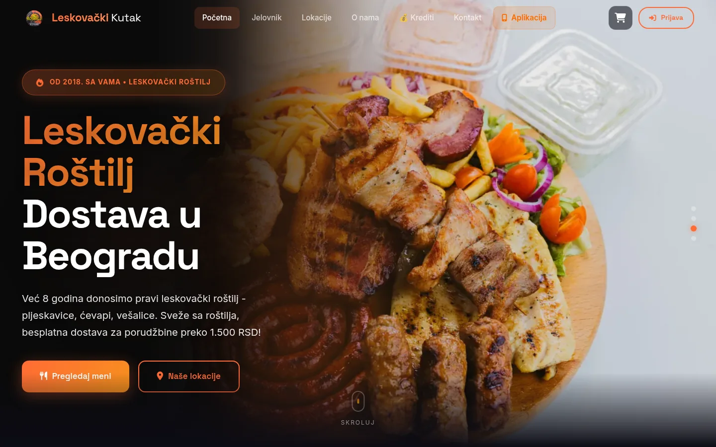
Grill restaurant with two locations in Belgrade: online order, selection of the nearest restaurant by address, credits and mobile app.
Case study
FOX Models
Immersive 3D concept for a modeling agency — ring of photos leading through the scroll, boards, model profiles and application form for new models.
Case study
Auto Delovi RM
Web shop of body parts with selection by make, model and year — over a thousand items, basket with cash on delivery and a panel from which the owner manages the offer.
Case studyNext step
Have a project that needs to work better?
Send me your goal and current situation. I will reply with a concrete scope proposal.
Start a project