Website2026-08-21
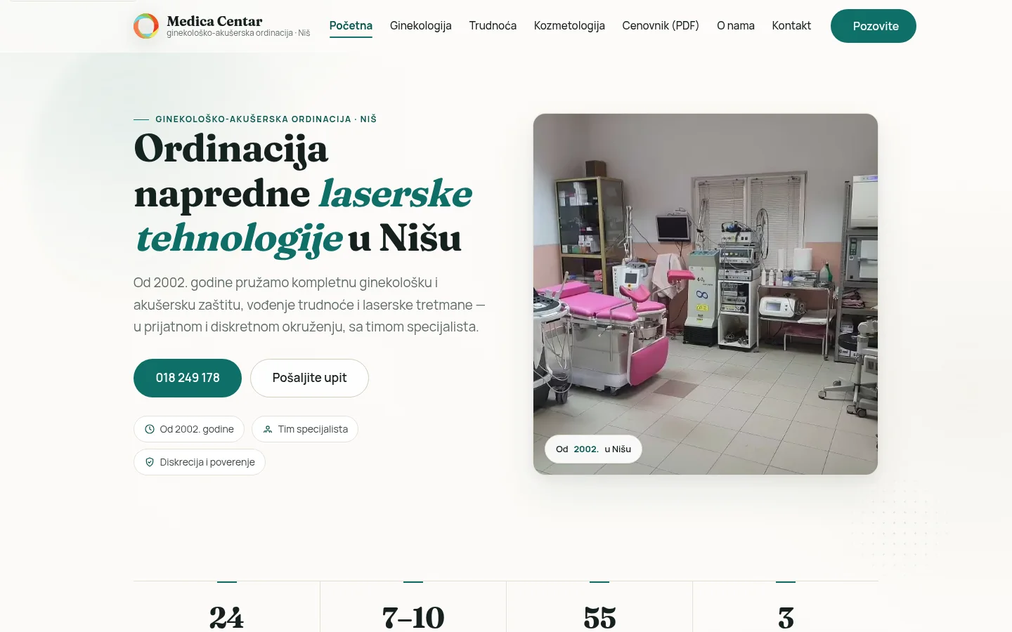
Medica Centar — a gynecology, obstetrics and laser cosmetology website
The practice, which has been operating since 2002, had an old static site with content whose value exceeded that of the old site: long professional texts, an archive of professional papers and videos. It was necessary to transfer all of that without losing a single URL, organize fifty-five service pages around it of services in three areas and give the practice an admin panel for managing future content changes.
- Client
- Medica Centar
- Activity
- Gynecology, obstetrics and laser cosmetology
- City
- Niš
- Type
- Multi-page site with admin panel
- Technologies
- PHP 8.3 · JSON · AVIF · Schema.org
- Status
- Live site, the practice edits the content itself
- Technology
- PHP 8.3 · JSON sadržaj · AVIF i SVG · Schema.org
Problem and context
What does Medica Centar do
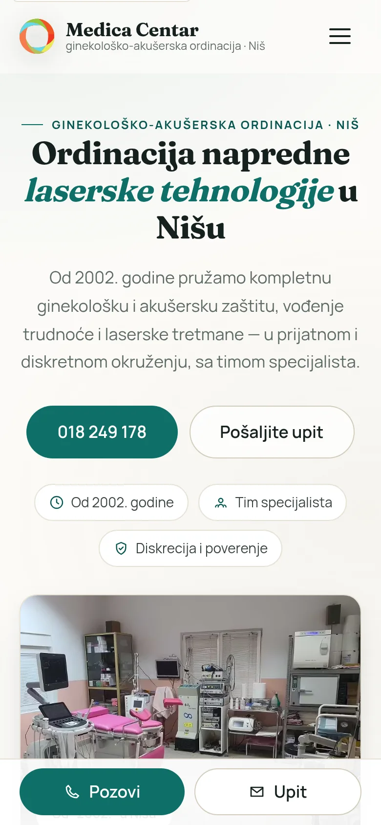
Medica Centar is a private gynecology and obstetrics practice in Nis, at Novosadska 1/c. It has operated since 2002 and, according to its own data, its team includes seven to ten medical specialists — gynecology and obstetrics, dermatology and radiology.
Its services are divided into three areas: gynecology, pregnancy management and laser cosmetology. The practice states that it works with a colposcope, a 4D ultrasound machine, a hysteroscopy system and a radiofrequency surgical unit, along with several lasers — CO2 surgical and fractional, Nd:YAG, diode 808 nm and alexandrite — as well as a HIFU and an IPL device. That list of devices is also the reason why the site has so many pages: almost every device covers at least one service about which patients ask for an explanation before calling.
The practice works with several insurance companies, and keeps the price list as a PDF. Appointments are arranged by phone or at the practice — the site does not try to be an appointment system, and that was a conscious decision, not an oversight.
What was the transition from
The old site was a set of static .html pages. It was not adapted to the phone, the structure was flat, and its visual design reflected the period in which it was built. But it contained something that cannot be made in two weeks: long professional texts written by the practice, an archive of 94 papers in PDF and 11 videos.
That changed the task. The task was not simply to create a new site and transfer several pages, but to transfer the existing content without losing a single URL and build a site around it that works on the phone. Google had known the old site for years; every old URL that returns 404 erases part of that history, and this loss is not seen immediately but after several months.
The second part of the brief concerned tone, rather than code. A healthcare website must not sound like a retail store. No exclamation points, no promises, no pressure to book immediately. The tone had to be calm and the content informative—a patient looking for an explanation before an examination should find an explanation, not an ad. That decision shaped both the layout and the typography, not just the text.
Structure: three areas, fifty-five pages of services
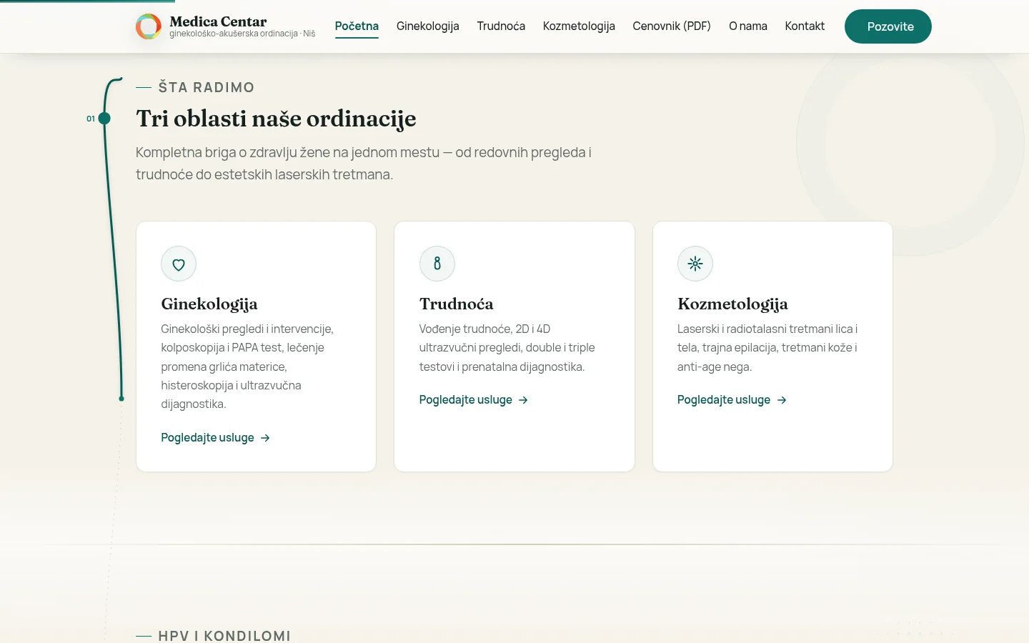
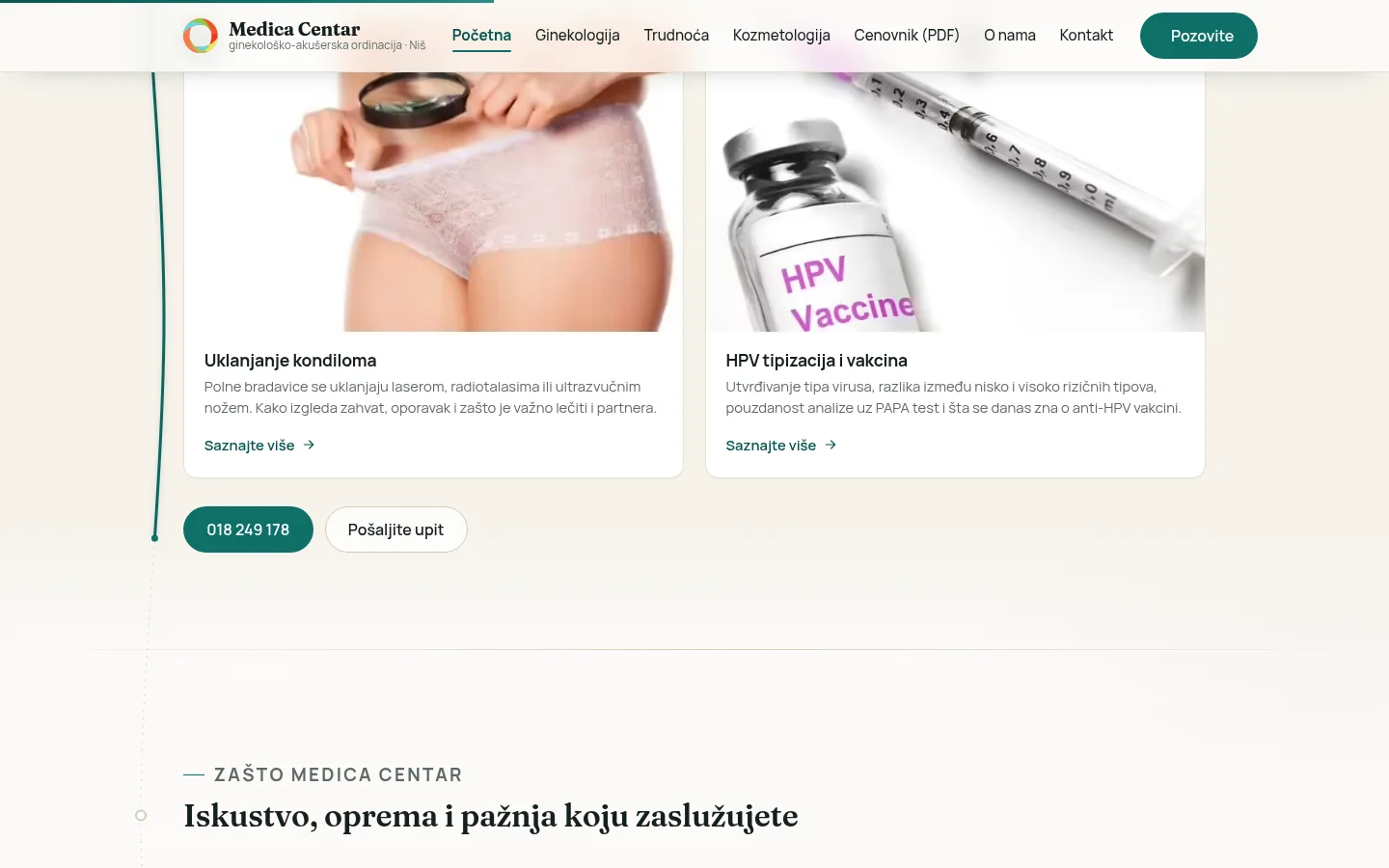
The site has three main pages, one for each area, and below them a catalog of services: 25 pages in gynecology, 10 in pregnancy and 20 in cosmetology. They are accompanied by a page about the practice, contact, promotions, professional papers and legal pages — a total of nearly seventy addresses.
A hub page like gynecology is not a list of links but a grid of cards with one sentence each that says what is on that page. Those sentences were written by hand, one by one. The first version mechanically cut them off in the middle of an ellipsis, and it showed on all fifty-five cards — and that one line is what the visitor reads before deciding whether to click.
Each service has its own page with the same skeleton: what it is, what the examination or treatment looks like, how to prepare and the most frequently asked questions. Longer pages, such as 4D ultrasound in pregnancy, have about fifteen sections each, so they have in-page section navigation and a reading progress bar. The pages are interconnected by a related field, so visitors can move from one service to related services instead of returning to the menu.
Content as data, not as fifty-five copies of the same file
The site is written in PHP 8.3, without a framework, without WordPress and without any plugins. It doesn't even have a database.
The presentation layer uses six shared components — header, footer, features, hub page template, and service-page template. Content is stored separately, in JSON files: one svc.json file per service, hub.json for each area, and several files for homepage and practice data and pages that do not belong to either group.
This means a change of the template appears across all fifty-five pages at once, and the modification of the text does not touch the code. When the PDF price list button needed to be added to the hub pages, one field in hub.json and one block in the template were added — not fifty-five times by hand.
Why no database: content changes rarely and is edited by one person. A database would be one more system that can fail and one more backup that must be created. In this way, the entire site fits into a folder that is copied in seconds, each version of the content is a simple text file, and differences between versions remain easy to inspect. If the content one day outgrows this form, moving to a database is a change to the reading layer, not a new site.
What the site looks like and where it was difficult
The client reviewed three design directions and selected the light theme. The first version of the palette had four accents, one for each area. feedback was short — “Too many colors.” Now the accent is a single, muted teal on warm neutrals, and it's used sparingly: headings, thin lines, a callout bar at the end of the page. A darker shade of the same tone is used for the text, for contrast.
A thin guide line runs through the pages that is rendered while scrolling, with content revealed on scroll and counters on the cover. This interaction required the most refinement. The line sits in the gutter next to the text, so the condition for leaving the container had to be "whether a gutter actually exists", not the width of the window — at exactly 1200 pixels the container touches the edge of the screen, there is no gap, and the line overlaps the text.
The more subtle issue was the word-by-word discovery mask. The wrapper with overflow: hidden is as high as one line of text, and the word inside it takes the full line height — so ascenders and diacritics on š, ć and đ are clipped. Every animated heading on the site was clipped, in Serbian you can see it immediately, and there is no error in the console. The mask was removed: the word is now revealed with transparency and a small movement, it looks calmer and cannot clip the characters.
Performance and images
All photos are in AVIF format, the largest is 52 KB, and the whole site contains about 1.2 MB of images. The hero image has a higher loading priority, fonts are preloaded, and image dimensions are written to the HTML so the layout doesn't move while they load.
Field data from real visitors, from the Chrome UX report, gives LCP 1.45s, INP 89ms and CLS 0, with a TTFB of 461ms and 94% loading in the green zone. The same page's lab test shows about four seconds, but that is a simulation of a slow network and a weak phone — a figure meant to find bottlenecks, not represent reality. When those two things get mixed up, it fixes metrics that are not affecting real users, and the site becomes more complicated in the process.
The logo was found to be a 300×80 pixel PNG, too small for a header on today's screen. It was redrawn in SVG, layer by layer, with careful smoothing at the layer boundaries — without this, white cracks are visible at the junctions of the layers, which are not present in the original.
Migration and redirect map
The site runs on hosting owned and paid for by the client. That ownership was intentional: the practice has its own domain, its own hosting and full access to everything.
Moving was the most sensitive part of the job. The old site was first saved intact in a separate folder, so a network of 69 redirects was created covering each old .html address. The redirects were not checked by eye — the script went through all 69 and looked for both the status and the exact destination. The archive with 94 professional works and 11 recordings was returned to the same addresses where it was, so as not to fall into 404.
Analytics and ownership verification in Search Console have been carried over from the old site; without it, both the history and domain ownership in Google’s tools are lost. The old sitemaps are intentionally left alive for a while, because they are the fastest way for Google to pick up new redirects.
A pitfall worth noting: the contact form used a common protection module on our server that is not available on other hosting, so every submitted inquiry would return an error — and that's the kind of bug that no one notices until someone complains that you're not answering. It was solved by a local copy of the module along with a controlled set of fallback paths. The form is then tested so that the client does not receive a test inquiry: the recipient is temporarily changed to my email address, a message is sent, and the original is returned. The sending domain passed authentication checks, so inquiries arrive and do not end up in junk mail.
Inquiry form, phone numbers and vouchers
The inquiry form needs to remain concise on a healthcare website. It asks for a name, phone, optional email address and a message, plus consent to be contacted and a link to the privacy policy. Above the field is the sentence requested by the practice: please do not include medical details in the message. The strongest data-minimization measure that can be incorporated into the form — is to avoid collecting information the practice does not need.
Below is a hidden field that the real visitor never sees; bots tend to fill it and thus give themselves away. Phone numbers are given priority over the form, because the appointment here is arranged in a few minutes of conversation. There are three phone numbers, and cosmetology has its own — each section displays the number relevant to that service area, so no one calls the central office to be transferred further.
A voucher generator runs on the promotions page: choose a package, enter a name, get a number in the form of MC-####### and receives a printable voucher. The price list is not a page but a PDF, the same as on the old site — the prices change, and the PDF is replaced by a single file, without touching the site and without changing any code. The address, map and working hours are on the contact page, and the working hours are pulled from the settings, so they can be changed in one place and changed everywhere.
SEO, schema and visibility
The site carries MedicalClinic schema data with address, coordinates, map URL, opening hours, area covered and links to social media. Along with that goes the BreadcrumbList on 68 pages and the FAQPage on 53 — the questions were not invented because of the structured data, but were taken from the 178 questions that were already written on the service pages.
Going through the meta data brought up three issues that revealed themselves. The 66 of 69 page titles repeated the practice name, in the form "Medica Centar — Medica Centar", because the template added the site name even when it was already in the title. Twenty-three pages did not have an social sharing image. The sitemap had two separate glitches: it was writing today's date to all 69 URLs on every change, and it only regenerated when the services section was touched. Now the date comes from the time of modification of the page itself, and the map is updated after every panel update, regardless of which section was edited.
An explicit policy for AI readers has been added to robots.txt, and llms.txt with a list of all services — because the practice should control this choice, rather than leaving it to third parties. Each section, such as cosmetology, has its own title, description and canonical URL, as well as each service in it.
Panel: the practice changes the content itself
The delivered site includes an admin panel on /admin/ which edits the entire content: homepage, all three service areas, each service individually including adding and removing services, About the Practice page, promotions, coupon, practice details, menu and pictures. There is no database here either — the panel writes to the same JSON files from which the site reads, so there are no two sources of truth that diverge.
What you don't see: the session lasts two hours, every submission has CSRF protection, five missed logins in fifteen minutes lock access, the password is stored as a hash, and the data directory is blocked from direct browser access via the browser. Before each write, the file is copied; the latest 25 versions of each file are retained, and writes are atomic, and every change is recorded in the audit log.
The panel check was performed in such a way that it could not pass by accident: each section’s form was submitted without a single change, so the HTML of the page was compared before and after. If the output is identical byte for byte, the field mapping from form to JSON and then to template is correct. All ten sections passed.
The strongest usability evidence is that the practice actively uses the panel. The owner himself redid the block with highlighted services and wrote the text in his own words. That's why, before each of our changes, the current live state is fetched first and compared with ours — otherwise the client’s change would be quietly overridden, and this is a mistake that is only discovered when someone notices that their text has disappeared.
Outcome
What the client received
The result is a site on the practice’s own hosting, with its own domain and full access. There are no monthly platform subscriptions, no plugins that break at the next update, and the practice retains direct control of its content.
Practically, it looks like this: a new service is added through the panel and at the same time it is on the hub page, in the sitemap and in the internal linking. Price changes by replacing one PDF. Business hours and phones are changed in one place. The old URLs from the previous site still work, as well as the archive of papers and videos that have been there for years.
There is still work that does not end with delivery. The domain is new, so its backlink profile is still very limited — it builds slowly and depends on how well the practice itself appears in local sources and directories. The content foundation is in place; the rest is time and patience.
FAQ
Frequently asked questions
Why doesn't the practice site have online scheduling?
Because a serious scheduling system would require the patient to submit the reason for the visit, and that information is then stored in the site's database. Appointments here are arranged by phone in a few minutes, and the form is used for questions and contact. It was a shared decision, not a technical limitation.
Can the practice itself change texts, services and prices?
Yes, through the admin panel. The homepage, all three areas, every single service, practice data, menu and images are editable without touching the code. The price list is a PDF, so it can be changed by replacing one file.
What happened to the old URLs and the archive of works?
Nothing was lost. Every old .html address was permanently redirected to the new one, 69 of them in total, and all of them were checked by the script. The archive of 94 papers in PDF and 11 videos has been returned to the same addresses where they were.
Why PHP and JSON and not WordPress?
Because it does not have to be maintained. There are no plugins that go out of date, no monthly updates that can crash the site, and no database that needs to be kept separately. The content is in text files, the whole site is copied in a second, and the smallest necessary stack leaves fewer things to fail.
How fast is the site on the phone?
Field data from real visitors gives LCP 1.45 s, INP 89 ms and CLS 0, with 94 percent loading in the green zone. The images are in AVIF format, the largest is 52 KB, and the dimensions are written in advance, so the layout does not move during loading.
Can the site be expanded with new services?
Yes. This was a requirement from the beginning. A new service is added through the panel and immediately appears on its hub page, sitemap and related services. A new service area would require one additional JSON file and the corresponding content.
Up next
Related projects
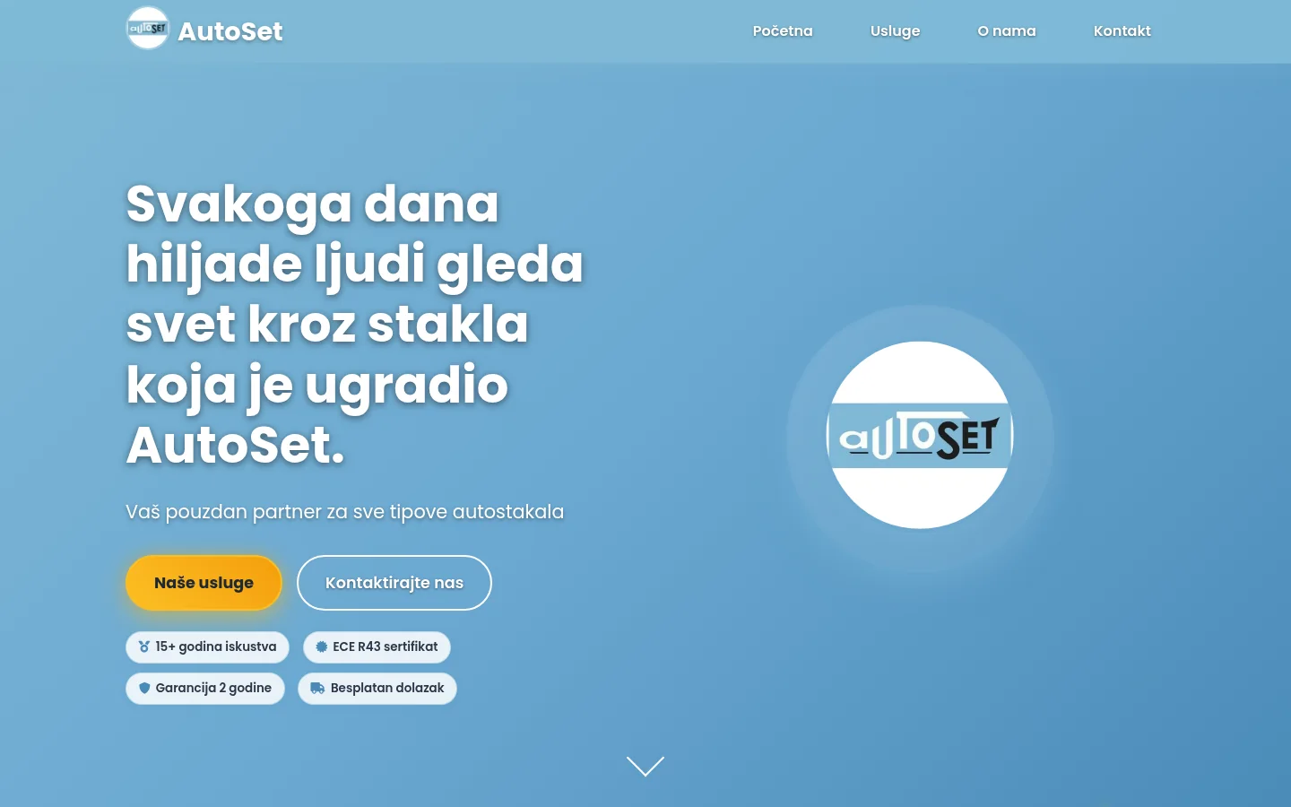
AutoSet Niš
Website for auto glass service in Niš — ten pages, including four dedicated local-search landing pages, and a separate panel for inventory from over seven hundred items.
Case study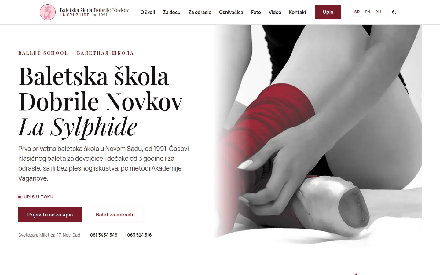
Baletska škola Dobrile Novkov „La Sylphide"
Ballet school website from Novi Sad in Serbian, English and Russian, with enrollment form and a gallery from the school archive — without CMS.
Case study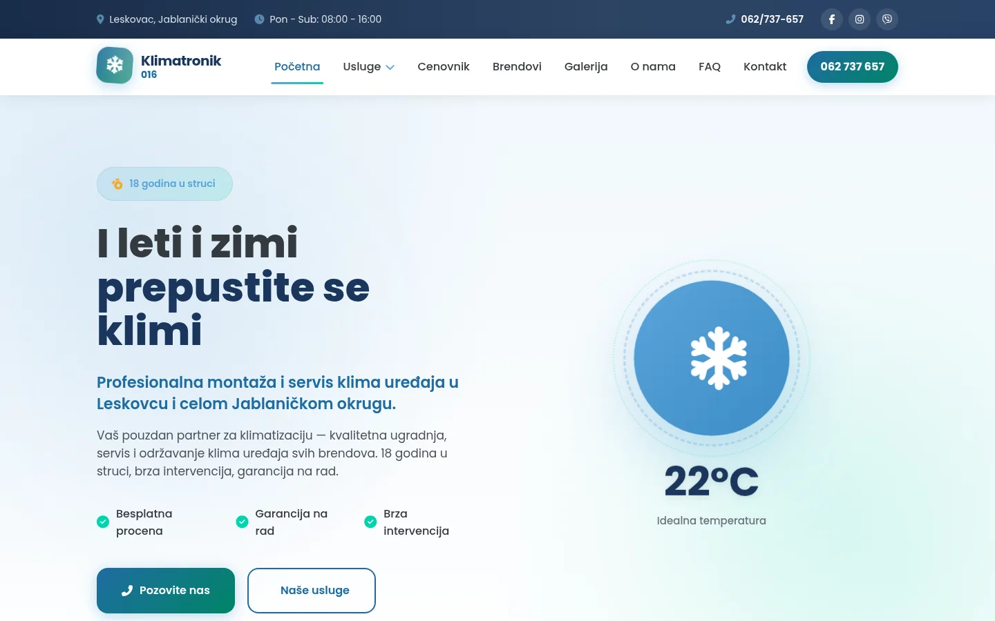
Klimatronik 016
A site for installation and service of air conditioners in Leskovac — without a contact form, everything leads to a call, with a price list and gallery of works.
Case studyNext step
Have a project that needs to work better?
Send me your goal and current situation. I will reply with a concrete scope proposal.
Start a project