Website2026-08-21
FOX Models — model agency modeling agency website without 3D
Same agency, same content, different technical decision. When the site's content is someone else's face, any effect that stands between the visitor and the photo is a cost — so this version is written in pure HTML, CSS, and JavaScript, with no frameworks and no build steps. Our subdomain, our project, open for verification.
- Client
- FOX Models, modeling agency
- Activity
- Model boards, scouting, booking
- City
- Belgrade
- Type
- Multi-page site without 3D (our project)
- Technologies
- HTML · CSS · JavaScript without libraries · nginx
- Scope
- 6 page types, 17 model profiles, no steps of construction
- Status
- Live on my subdomain, closed for indexing
- Technology
- HTML · CSS · JavaScript bez biblioteka · nginx
Problem and context
Who is FOX Models and whose site is this
FOX Models is a modeling agency from Belgrade. He leads the women's and men's board, looks for new faces and places them with fashion houses, magazines and brands — from the first test shoot to the campaign. The agency's job is to bring the right person to the client who chooses, and the website is the first place where that choice begins: open the board, scroll through the pages, remember two names and write on the booking.
Immediately to know whose this is. models.svilenkovic.rs is my subdomain and our own project. The site was created as a redesign proposal for the agency, it is alive on our server and serves as an example of work. The names, measurements and part of the photos are demo content that stands in one place in the code and when switching to the agency's real domain, it is replaced by data from its database.
That's why the text below does not contain any figures on attendance, inquiries or campaign results. There is only what can be opened and checked: how the site was assembled, why it was made this way and not differently, where it broke and how it was repaired.
Two versions for the same agency and why this one got a continuation
For FOX Models there are two sites, not one. This one is bright, classic and doesn't have any 3D lines in it. The other is dark, with a 3D ring of photos that rotates as you scroll, and is the subject of a separate study — FOX Models, dark 3D version. Same content, same agency, two completely different impressions.
The reason for two performances is simple. At a fashion agency, the taste of the owner decides more than any list of functions, so instead of guessing, I prepared two contrasting directions: maximum atmosphere and maximum silence. When the agency looked at both, the answer was that the richer version was too much and that the cover should be much simpler, with a reference to the Scandinavian agency sites with nothing but faces.
This is where this study breaks down. 3D is not a bad choice because it is 3D, but because it consumes what is the only content on this site — photography. When the customer comes to inspect the board, every effect between his eye and his face is a cost that someone pays. The classic version therefore got all the further work and all the rounds of changes, and 3D remained as the answer to the question of where the upper limit of the atmosphere is.
The decision also affected the typography. The original amalgamation of a serif title and another typeface for text has been replaced with a single grotesque throughout — the same typeface for title, measure, and navigation. Fashion sites rarely mix the two letters, and when they do, it's usually the only decoration they remember.
What needed to be solved
A modeling agency site looks like an ordinary gallery until you sit down to put it together. Then it turns out that there are five requests that pull in different directions:
- A photo is a product. Anything that stands over the image, cuts it or stretches it, works against the site. The frame must be accurate at every width, on a phone to large monitor.
- The board is not read, the board is scanned. The customer does not read the descriptions but looks over the face and stops at one. The grid must load quickly, and basic measurements within reach without opening a profile.
- Each model is its own address. The profile is forwarded to a colleague, opened on the phone and pasted into a message, so it must have its own URL, its own title and its own preview image.
- Registration of new people is not the same as booking. Scouting arrives from unknown people, on a phone, with two to three photos. It is not the same form and must not look the same.
- In the end, the content comes from the database. On the real domain, models and editorials are served by PHP from the agency database, so the front end must be written so that it doesn't care where the data comes from.
The last item specified the technology. When it is known in advance that the content will one day come from the database and will be changed more often than the code, the site that has to be rebuilt with each change works against itself.
Title: two letters and nothing more
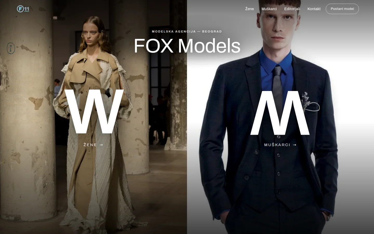
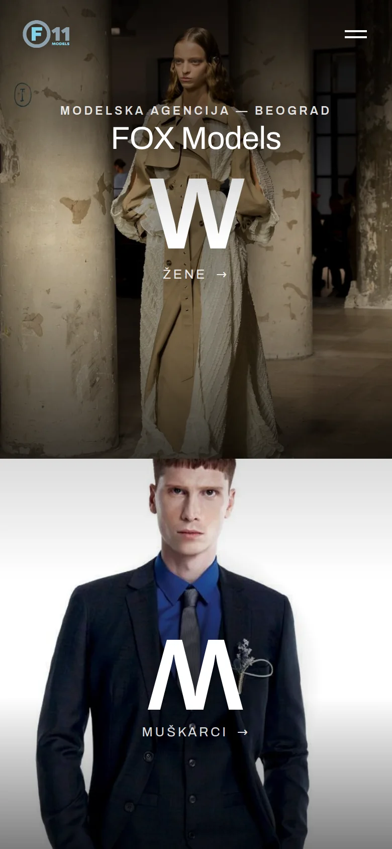
The first screen is exactly as tall as the device screen and is divided into two panels: the left half leads to the female board, the right to the male board. Across each panel is a single huge letter — W on the left and M on the right — and below that a tiny signature with an arrow. The agency name is at the top, over a soft blackout that keeps it legible even when the photo is under light.
A detail that no one notices, but was specifically requested: the letter M is not the letter M. It is the same letter W turned upside down, so the two panels are symmetrical twins instead of two different characters. The letter lift on mouseover had to be written so that the rotation remained, as a normal scrolling animation would silently cancel it and M would revert to W mid-move.
Choosing photos for the panels is not about aesthetics, it's about checking on a wide screen. The image on the panel is scaled by width, without horizontal cutting, so the entire frame is visible on the 1920 pixel monitor. The first image for the men's panel had the full brand logo on the garment, which was not visible at all on the three smaller widths, and was replaced by another. For the same reason, magazine covers with the name of the magazine written on them and photos with advertising text over half the frame were not included in the selection below — the agency's website must not look like it is advertising someone else's brand.
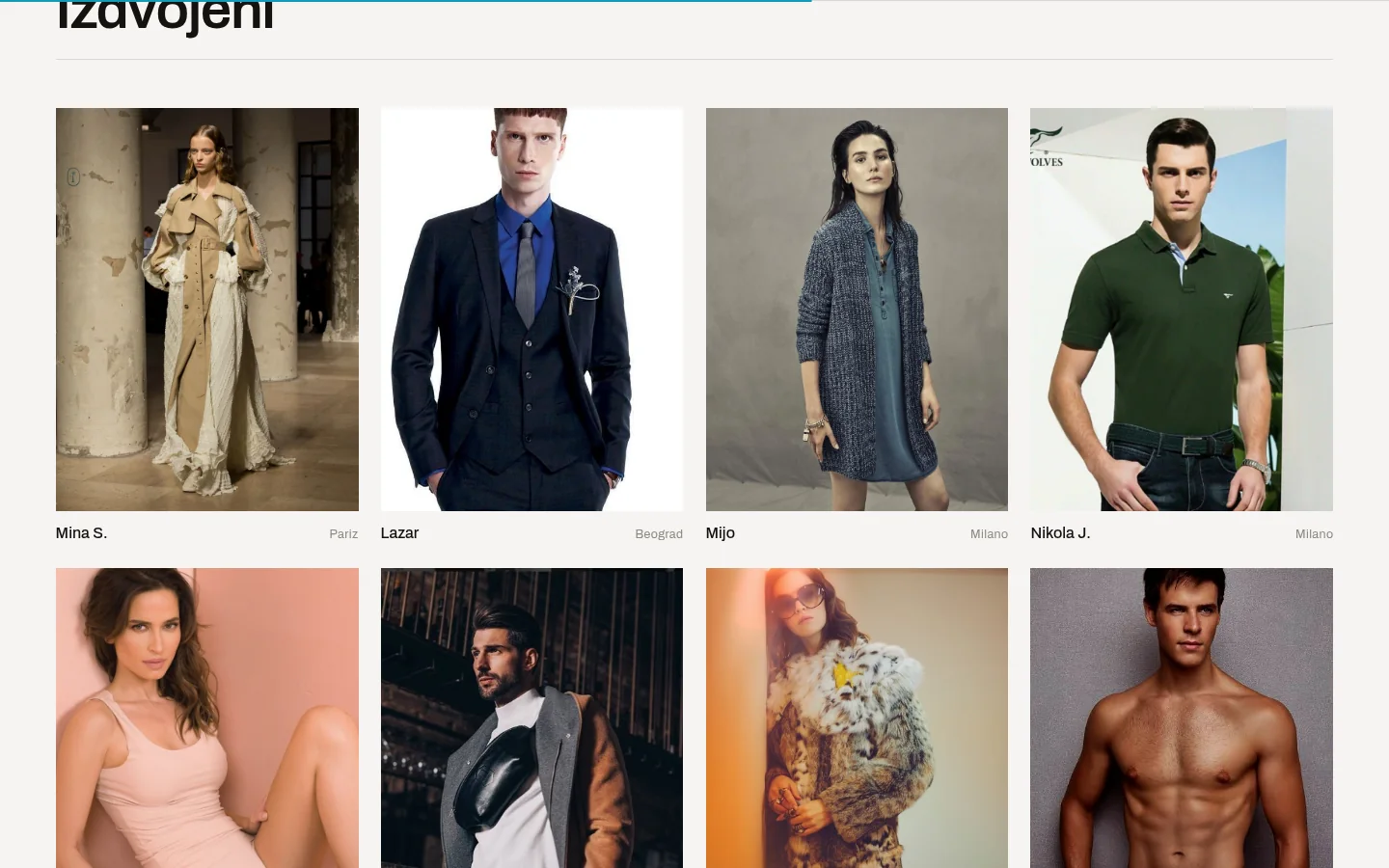
Below the first screen is the Separate section: eight faces, four from the female board and four from the male board, balanced and with the Main Board in front. There was also one such bug. The order of the boards is read from a table where Main carries zero, and zero is a dummy value in JavaScript, so the backup number overran the real one and the Main Board would come last instead of first. The fix is to check if the key even exists, instead of relying on it being non-empty.
Boards, filters and A–Z index
Female and male board are separate parties, not two states of the same. The women's board and the men's board have the same sub-navigation: Main Board, New Faces, Commercial and, slightly separately, Contact. Each board has its own address, so the link to New Faces can be sent as a link to New Faces, and not as an instruction to click somewhere else.
Above the grid are a search by name that works as you type and the number of displayed models that changes on the fly. They are accompanied by an A-Z index of Serbian letters, including Č, Ć, Đ, Š and Ž, in which the letters without any model are visibly extinguished and cannot be clicked. An index where the letter leads to a blank page is worse than an index without it, because the visitor thinks the site is broken.
The index itself is hidden on small boards and appears only when the board has twelve or more models. On the six-faced demo board, an alphabet where almost every letter is off looks like a glitch; on the real board of the agency, with several hundred names, the same bar is the fastest way to reach the surname. Same logic, two different behaviors, without a single change in the code when switching to the database.
The card shows a photo, name and city. Hovering the mouse over the image brings down a layer with the full set of data — height, measurements, shoes, hair, eyes, side marker and a call to open the profile. There is that layer on touch screens, because there is no mouseover on the phone: there the photos are clean, and the data is read on the profile. The same card is rendered by the same code on the cover, on the board and below the profile, so the display cannot be separated between the three places.
Model page and booking that goes by email
The profile is divided into a gallery on one side and data on another page: board mark, name, city, and a neat list of measurements — height, chest, waist, hips or suit, shoes, hair, eyes. Below them are two steps: Booking inquiry and Instagram account of the agency.
Booking has intentionally remained an email. The click opens the mail program with a filled-in recipient, a title that says the name of the model and a body of the message that already contains the name, city and link to the profile, with empty lines for the project, appointment and contact. The customer who books the model does so from his inbox, because the inquiry must remain in his correspondence and be forwarded to a colleague. The form on the site would throw him out of the tool in which he really works, and give the agency a message with no history.
Under each profile are four people from the same board and a link to the entire board. It's the only navigation that really works on a site like this: a person who has opened a profile is rarely looking for that particular face, but the face of that guy.
Buttons on the profile have gone through a round of changes. The first version was bordered pills, which on the bright side looked cheap, and were replaced by thin text links with an underline and an arrow. On a fashion site, a shouting button is the only element that is remembered instead of a photo. It is the same reason why the mobile menu is reduced to two straight lines that intersect when opened.
Editorials and lightbox
Page Editorials is a wall of covers, editorials and campaigns — ELLE, Grazia, Stylist, Legend, Terranova — with the name and type of collaboration under each item. Click to open the view over the entire page.
Lightbox is also written for the keyboard: the arrows scroll, the exit key closes, the focus stays trapped inside the view while it's open and returns exactly to the image it started from. On the phone, it scrolls by swiping, the adjacent image is loaded in advance so that the transition doesn't have to wait, and the counter shows where you are in the sequence. A gallery that cannot be closed with a button is a gallery from which some visitors exit by closing the entire browser tab.
Images drawn by JavaScript sink softly when they arrive, instead of jumping in and moving everything below them. Static first screen images don't have that delay — the hero photo is what's measured as the largest element of the page and has to be there immediately, so it loads with priority and without any effects in the way.
No build steps: about seventy kilobytes of custom code
The site is written in pure HTML, CSS and JavaScript. No build steps, no framework, no libraries. All native code is three files — styles, behavior and data — totaling about seventy kilobytes before compression, and the server sends them packed. The only external thing the page drags is the font.
The content is in one data file: seventeen models, twelve in women's and five in men's board, and ten items in editorials. The fields in that file are deliberately written to correspond to the columns that should be returned by PHP from the agency database on the right domain — one model is one row in a table, editorials are another table. The transition from demo data to the database is therefore a replacement of the source, not a rewrite of the site.
There is also the main practical difference compared to the 3D version. It is a Next.js project that must be rebuilt on the server every time the content changes, with dependencies installed and all static pages assembled. Here, the modified file is copied to the server and that's the whole job. Deploy goes directly, with a backup copy of each file before modification, without intermediaries and without a step that may one day fail due to someone else's modification in a package.
There is also a fuse in case JavaScript fails. In the header, a mark is immediately written to the document that the scripts are working, and the appearance of the content when scrolling depends on that mark. If after loading it turns out that the header of the site is not drawn, the mark is removed and everything that was waiting to appear becomes immediately visible. A site without scripts isn't pretty, but it's readable — and a site that sits silently blank is a lost visitor.
Screen adaptation is tested from narrow phones to very wide monitors. Horizontal overflow is cut at the document level, so the page doesn't jiggle left and right even at 320 pixels, and long addresses and emails in the footer wrap instead of pushing the layout over the edge. The content has an upper width limit, because the grid of faces stretched across the entire very wide screen is no longer a grid but a strip.
Two bugs that were only seen on the phone
First: Phone visitors were stuck on the old version and had to manually clear the cache to see the changes. The cause was not in the code, but in the server settings — styles and scripts were sent with the order to be kept for thirty days and not checked at all. That tag only makes sense for files that have a content footprint in the name; here the name was the same every time, so the browser showed what it remembered for a month, no matter what changed on the server.
The repair was in two parts. Styles, scripts, and HTML are now always checked against the server; if nothing has changed, the server responds with a short "same" and does not send the content again. Images are still cached for seven days, but without a check ban. In addition, the address of the styles and scripts has been changed once, because changing the rules does not retroactively affect what the phone has already remembered — only the new address flushes such a cache.
With that repair came two surprises that are worth more than the repair itself. First: as soon as a custom header is added to one part of the configuration, the inherited security headers silently disappear from that part, so they must be returned to each such block — otherwise the cache fix loses the protection without anyone noticing. Second: the enabled server configuration was not linked to the file being edited, but a separate file with its own content, so the first changes had no effect and it seemed as if the server was ignoring the configuration.
The second error was worse, because it looked like a code error: whichever model was clicked, the same profile opened — the first one in the list. Everything worked locally, but not on the live site. The cause was a line in the configuration that redirects old URLs with an extension to clean ones: it redirected correctly, but at the same time it threw away the part of the address that says which model it is. The page therefore received no model identifier and displayed the first of the series. The same thing happened to the pre-filled booking request. The fix is one addition in that line that forwards the query string on.
Both errors are worth noting for the same reason: neither is visible in the site's code, and neither would be found by a test on the local machine. They are only seen if the site opens the way the visitor opens it.
Outcome
SEO, closed indexing and what the agency gets
Everything the search is looking for is already in place. Each page has its own title, description, and canonical URL; the homepage contains information about the agency and the site, boards contain a list of models as a collection, profiles contain information about the person and breadcrumb path through the site, editorials contain a gallery. The addresses are clean — /women, /men, /editorials, /contact — and old URLs with extensions are permanently redirected to them.
Along with this is a move that looks like an oversight until it is explained: the site is closed for indexing, and the canonical URL points to the agency's domain. On my subdomain, it should not be in the search, because it would appear as another result for the agency name and split the signals into two addresses. That's one line that gets removed on the day of switching to a real domain, and then all of the above starts working for the agency instead of just standing still.
On the page Contact and application there is also a part that is not technical but protecting the industry: scouting is always free, the agency never asks for payment for enrollment in the board and does not respond via unofficial accounts. Fake scouts on social media are a real problem in this business and the only thing the site can do is to clearly state what real communication looks like. Open about the limit of this implementation: the login checks the fields, accepts two to four photos by swiping and displays a confirmation, and the actual sending and receiving of photos is bound when switching to the right domain, to the same server layer that then serves the model data.
What the agency gets in the end. A site that opens immediately because there is nothing to run; a profile for each model with an address to be sent to the customer; a sidebar that filters and searches instead of scrolling to the bottom; one file to attach its base to, so adding a model doesn't mean calling us; and a look that doesn't compete with photos. No subscriptions, no deprecating dependencies, and no build step that stops working once.
And that part for which this study exists in the first place. The 3D version is stronger on the first screen, this one is better for everyday work. When the content of the site is someone else's face, the best technical decision is usually the one that goes unnoticed.
FAQ
Frequently asked questions
Why does this version omit 3D when another concept uses it?
Because on the website of the modeling agency, the photo carries the whole job, and every effect around it consumes the attention that is intended for it. After comparing both versions, the agency asked for a much simpler cover, so this one got all the further work. The dark 3D performance still stands alive, as an answer to the question of where is the upper limit of the atmosphere.
Why use no framework or build step?
Because the content here is the only thing that really changes. The entire proprietary code is three files of about seventy kilobytes, so each change means copying one file to the server. With a site that has to be rebuilt, the same change means installing dependencies and assembling all the pages — and one more step that can crash.
Can the agency add the models themselves?
In this version, the content is in one place in the code, because it's a view. The fields in that file are pre-compiled so that they correspond to the columns from the agency's database, so when switching to the right domain, the data source is replaced without affecting the appearance, and the models and editorials go through the administration.
Why does the site not appear in Google search?
It is intentionally closed for indexing because it is on my subdomain. If it was open, it would compete with the agency's real site for its own name and split signals at two URLs. The ban is one line in the header and is removed the day the site moves to the agency's domain.
Why does the booking inquiry go by email and not through the form?
Because the customer who books the model works from his inbox — the inquiry must remain in his correspondence and must be forwarded to a colleague. Clicking on the profile opens a message with a filled-in recipient, a title with the model's name and a body with the city and a link to the profile. The form would throw it out of the tool it actually works in.
Why aren't the model measurements visible on the phone when tapping the card?
Because there is no mouseover on the touch screen, the measurements layer would either stay over the photo or appear on first touch instead of opening the profile. That's why the photos are clean on the phone, and the entire data set is on the model side, which can be reached with the same touch.
Up next
Related projects
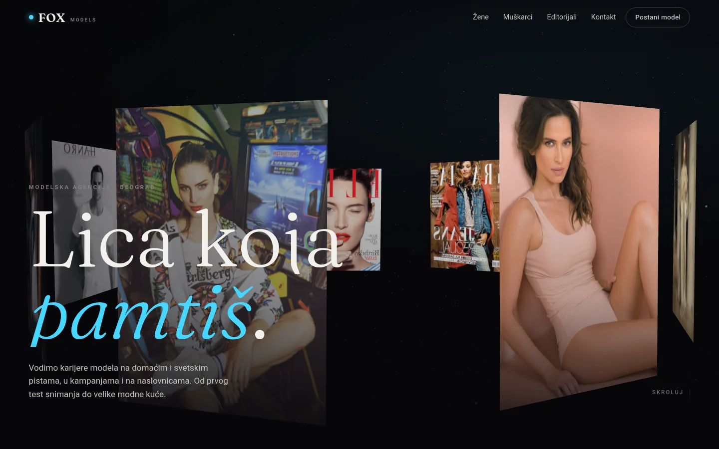
FOX Models
Immersive 3D concept for a modeling agency — ring of photos leading through the scroll, boards, model profiles and application form for new models.
Case study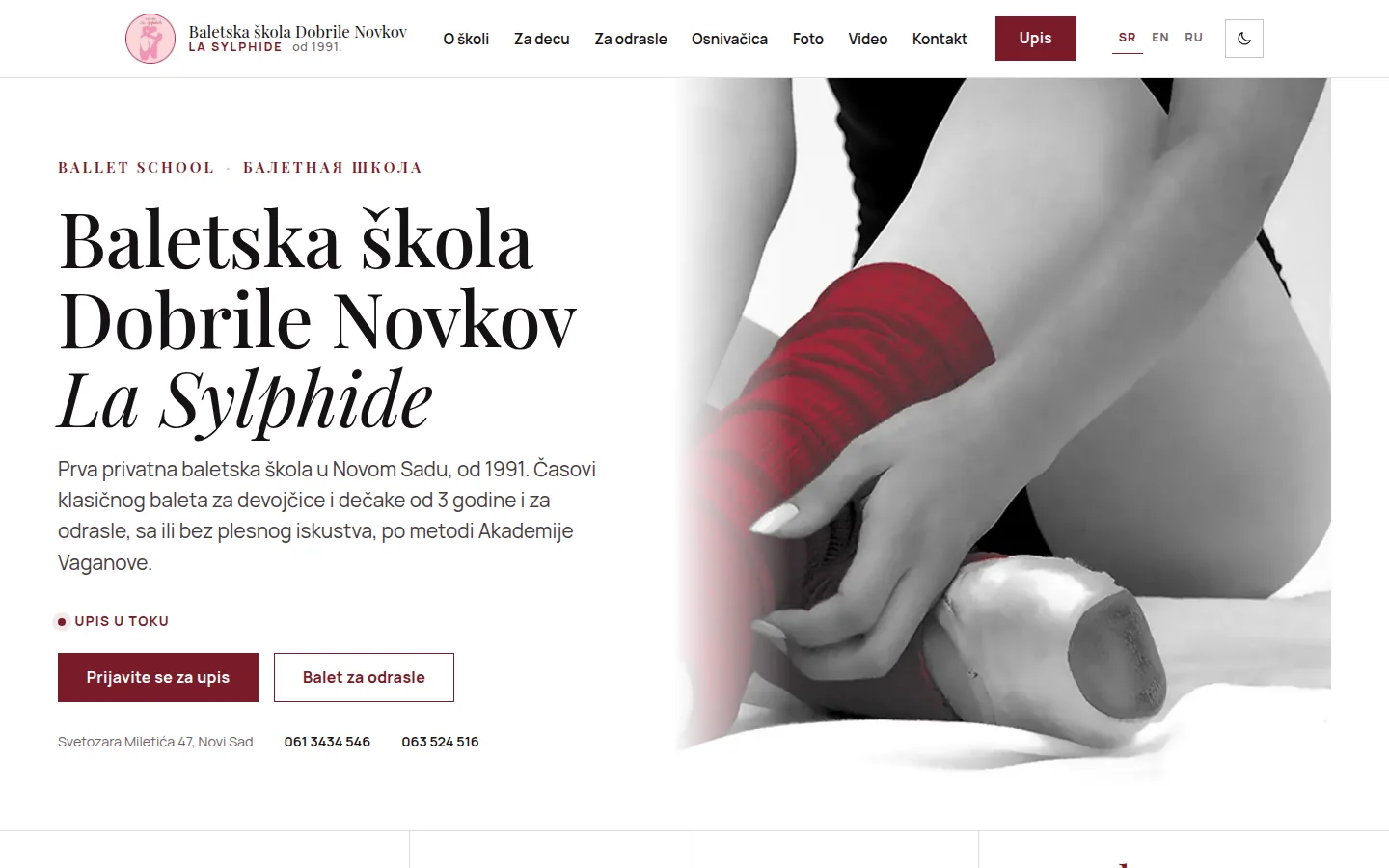
Baletska škola Dobrile Novkov „La Sylphide"
Ballet school website from Novi Sad in Serbian, English and Russian, with enrollment form and a gallery from the school archive — without CMS.
Case study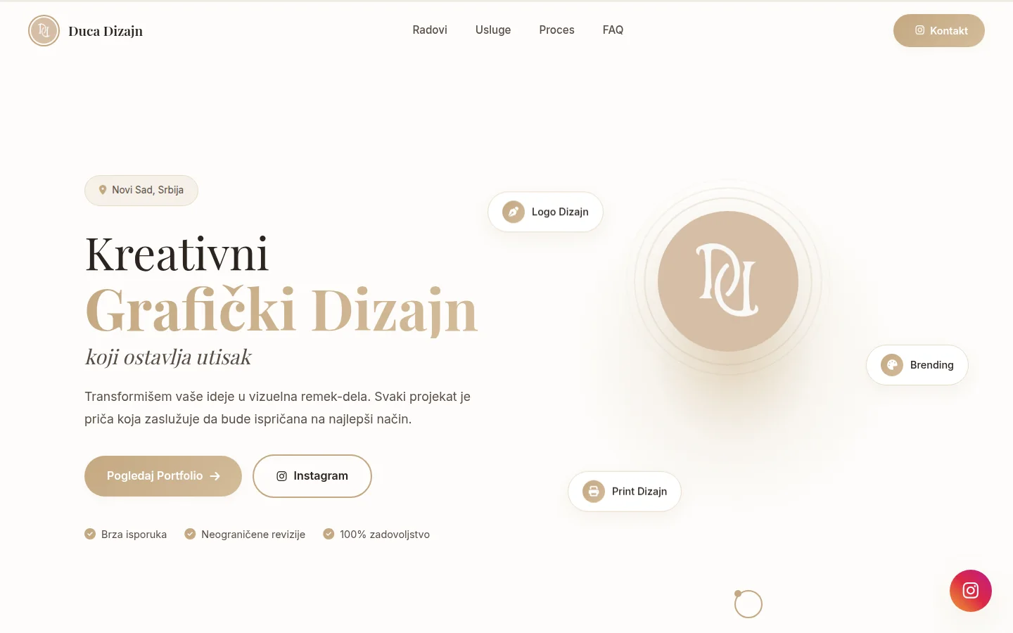
Duca Dizajn
Portfolio of graphic designer from Novi Sad — services, work process and FAQ on one page, with Instagram as contact.
Case studyNext step
Have a project that needs to work better?
Send me your goal and current situation. I will reply with a concrete scope proposal.
Start a project