Website2026-08-21
Duca Dizajn — a portfolio website connected to an established Instagram presence
Graphic designer from Novi Sad who runs his entire business through Instagram. The profile shows the works, but does not answer the questions that a person asks before writing the first message — what exactly is being done, how long it takes, what is obtained at the end. The site was created to answer that and return the visitor to the profile.
- Client
- Duca Dizajn
- Activity
- Graphic design — logos, business cards, invitations, brochures
- City
- Novi Sad, Vojvodina
- Type
- Portfolio site - one long page and legal subpages
- Contact channel
- Instagram, no contact form
- Technologies
- HTML5 · CSS3 · Vanilla JS · GSAP 3.12 + ScrollTrigger
- Status
- Live site on my subdomain, under active maintenance
- Technology
- HTML5 + CSS3 · Vanilla JS · GSAP + ScrollTrigger · Consent Mode v2
Problem and context
What does Duca Dizajn do
Duca Dizajn is a graphic designer from Novi Sad. It does four things: logos and visual identity, business cards, wedding and party invitations, and print material — brochures, catalogs and flyers. There is no agency or office to stop by; the work goes directly, from the first conversation to the final files.
The channel where everything happens is the Instagram profile @duca.d.dizajn. That's where the works are, that's where the inquiries arrive, that's where the agreements are made. For a designer, it makes sense — work is visual, and Instagram is a place to look visually. The problem starts with those who are not yet sure: they want to know exactly what they get, how long it lasts and what the cooperation looks like, and the profile does not answer that. Scrolling through posts from three months ago is not the answer.
Works for real clients already existed — series of business cards, logos, illustrations, press material. One address was missing that would sort it out, explain and put the price on the table.
What needed to be solved
The request was narrow and clear, and that's why it was easy to miss. The site should not replace Instagram but do what the profile cannot:
- To answer before someone answers. What is being done, how is the work going, how long does it take, which formats arrive at the end, how is it paid.
- To have a price. Not a final one, but an initial one — so that one knows if one is even in one's range before writing a message.
- To lead back to the profile. The contact channel remains Instagram. The site does not have a contact form and should not have one; profile message is faster and the designer is there anyway.
- To be yourself. No CMS, no add-ons and no monthly subscription to keep one page online.
One thing can be seen from the address itself, and it should be said immediately: the site is located on the subdomain ducadizajn.svilenkovic.com, so on our domain. It's not a demo — Duca Dizajn is a real client and the content is his — but an agreement to get started without buying and maintaining your own domain annually. When the need arises, the transition is a change of address and redirection, not the creation of a new site.
How the one-page site is structured
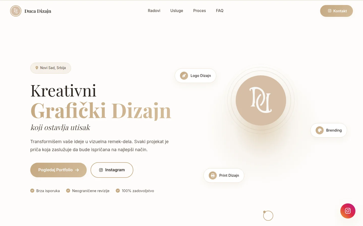
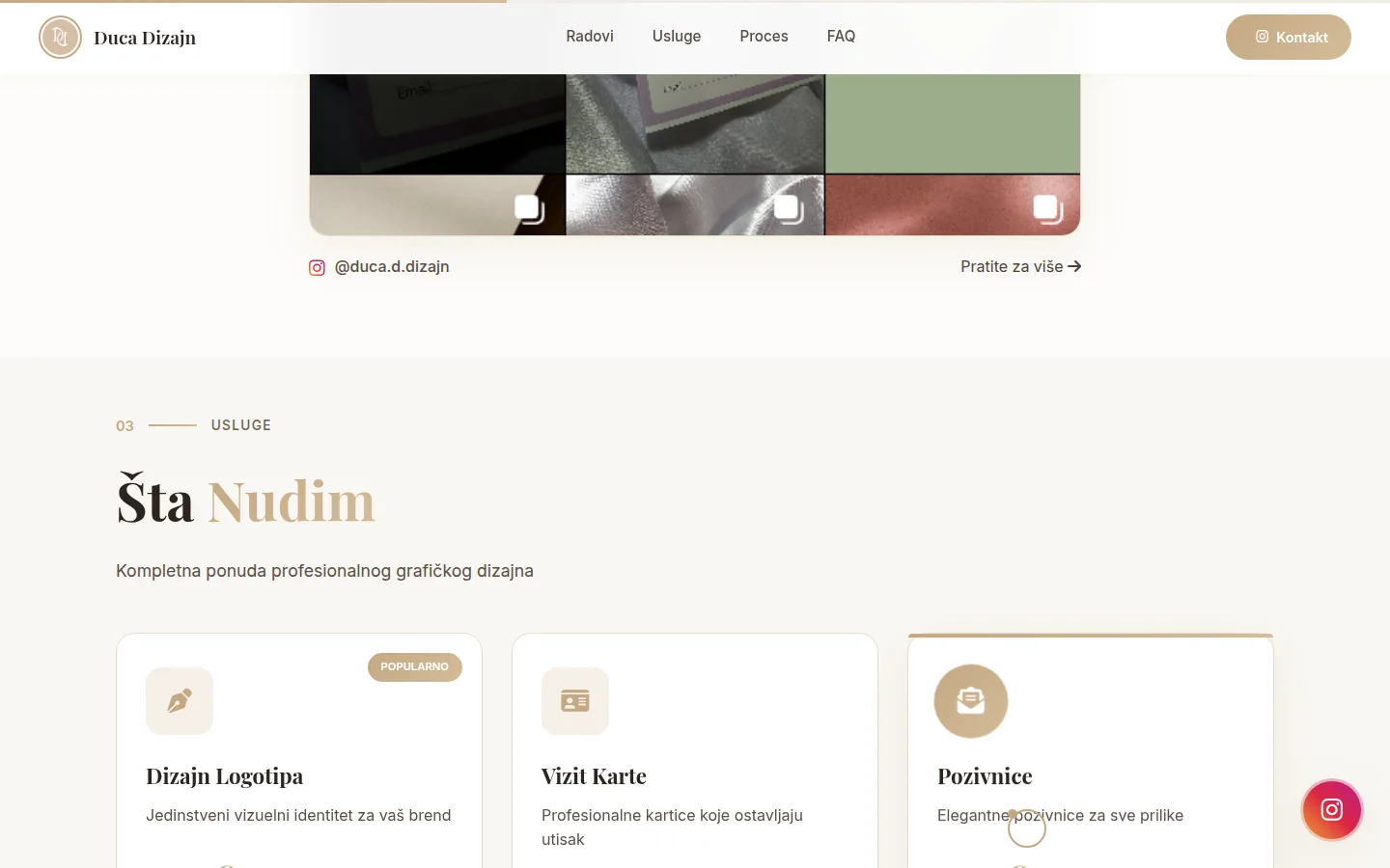
Everything the visitor needs to see is on one page, divided into five units that are numbered while scrolling: introduction, My Works, What I Offer, Work Process and FAQ. The navigation at the top does not lead to other pages but jumps to those sections, and the Contact item leads directly to the Instagram profile.
The introductory screen says who they are and what they do in one sentence and offers two outputs — a portfolio or a profile. Below are three labels that cover the activity (logo design, branding, print design) and three short claims that the designer himself makes: fast delivery, unlimited revisions, customer satisfaction. Those are his words and that's how they stand.
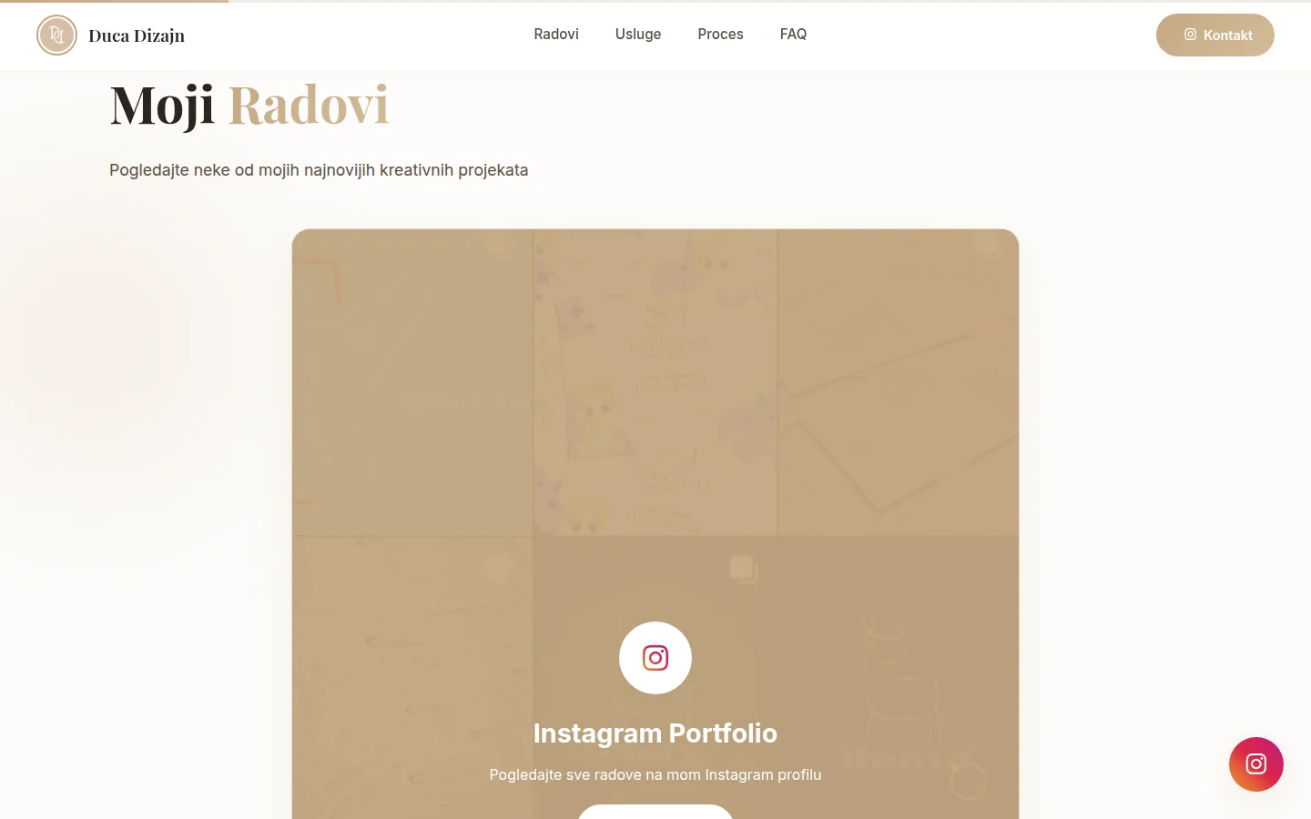
The My Works section is intentionally not a manually maintained gallery. Instead of a row of images that someone would have to change every time a new work is created, there is a single card with a collage of works that leads to the profile. The reason is practical: the designer posts on Instagram anyway, and the gallery on the site would fall behind already after the first week and after half a year would lie about what he is doing today.
In addition to that one page, there are three legal sub-pages and its own page for error 404. That's the whole site — five documents, nothing more.
Services and how the price was decided
Section What I Offer is four cards, each one for each service. Each carries a short description, a starting price marked "from" and a list of what's included — with logos, that's multiple concepts, revisions, all file formats, and basic rules for using the mark; for business cards, design of both sides, preparation for printing and option with QR code. Logo design card has been marked as most wanted.
The price is deliberately set as a starting price, not as a price list. Graphic design is not sold by the piece — a business card for one man and a series for a company with ten employees are not the same business, even though they are called the same. The mark "from" captures that difference without prior negotiation, and the Terms of Use spell it out literally: the amounts are indicative, the final price depends on the complexity, number of revisions, delivery format and deadline, and is agreed upon before the start of work. The price confirmed upon acceptance of the order is binding on both parties.
The same prices are also in the page’s structured data, as an offer with each service. When the price changes, it changes in both places — it's not magic, both records are in the same file about twenty lines apart, so it's hard to forget. A site where the visible price and the structured data price say different is a common and silent mistake.
Workflow and questions that reduce repetitive inquiries
The two sections exist only to make the first message shorter. The Work Process is four steps — conversation, sketch, design, delivery — each in two sentences. This is not because the process is complicated, but because the person who orders a design for the first time does not know what awaits him, and this ignorance stops him before he even asks.
FAQs do the same thing, only more directly: how long does it take to make, can I request changes, what formats do I get, how does payment work. The answers are short and specific — the deadline is in working days, with a note that there is also an urgent variant, a list of formats that arrive at the end, and a division into an advance before the start and the rest after completion.
Those four questions were not invented to give the section content. These are the questions that arrived in the messages, one after the other, and each time asked for the same answer typed over and over again. Now they're on the sidelines, so the message that arrives after them usually already knows what they want — and that's the difference between ten messages that turn into one job and ten messages that eat up the afternoon.
Questions and answers are also machine-readable, written as FAQPage, so they can appear directly in the search result, under the site title.
Performance — static HTML and nothing more
The site is clean HTML5, CSS3 and vanilla JavaScript. No PHP, no database, no CMS, no plugins. The entire header is one file of about thirty kilobytes that the server sends as it is, without any execution in between.
Decision is not laziness but calculation. One man's four-service portfolio changes several times a year. A CMS of that scale would mean a database that could crash, an administration that had to be updated every month, and an admin application kept online for three hundred and sixty-five days because of the change that happens in March and October. A static page has nothing to hack through a login that doesn't exist.
What you get is speed without optimization: no queries, no page generation, no caching to set up and check. Nginx sends the file, static has a thirty-day cache, compression is turned on, and that's the whole performance story.
The source code is in the git repository and is synchronized to the server, so that every change has its own trace and can be returned. The maintenance mode files, which are in the same folder, are blocked at the server level to prevent anyone from accidentally opening them.
What broke and how it was fixed
The most interesting part of the job was not the design, but an invisible defect.
The site uses GSAP with ScrollTrigger to display sections and Font Awesome for icons. Both were initially loaded from a public CDN, as is usually done. Then content security policy has been tightened across our entire fleet so that the browser can only execute scripts and load styles from the same domain. Result: script blocked, icon styles blocked, animations dead, all icons invisible.
The trick was that the site didn't crash. The sections remained visible, because an animation that never runs leaves the element where it is. The page opened, the text read, nothing screamed that it was a mistake — it was just dead. Such a malfunction survives for months if no one opens the console.
The solution was for libraries to stop lending. The exact versions of GSAP and Font Awesome, with all webfont files, were downloaded and uploaded to the site itself. By the way, the dependence on someone else's server, which one day may change the address, slow down or cancel the version, also disappeared.
Two details showed their teeth. First: the files were first placed in /vendor/ and still returned a 404 — because a rule that applies to all sites on the server deliberately hides that folder, since that's what a directory with other people's code that has nothing to make public is usually called. Instead of touching the common rule that protects the entire server, the libraries have been moved to /assets/vendor/. Second: index.html was marked as immutable at the filesystem level, so the autosync was silently firing and leaving a message in the log that looked like a branch problem in git. The flag was removed and the sync worked.
Animations, speed and devices
Animations are there to guide the eye, not to be noticed. Sections appear when scrolling, the title is separated into words, there is a thin strip at the top that shows how far you have come, and on large screens the cursor takes on its own shape. All this is conditional: the cursor is created only above one thousand two hundred pixels wide and only if the visitor has not asked for less movement in the system. Whoever turned on that option gets a site that stands still.
The image is almost gone — a logo, a collage of works and an social sharing image. The collage is loaded only when it comes to its turn and has dimensions entered, so the page does not bounce while it is loading. The fonts are Playfair Display for titles and Inter for text, with a pre-opened connection to the source so that the first letter does not wait. Double loading of the same font — once through a header tag, once through a CSS import — has been removed; it is a mistake that no one notices, and it is paid for every time it is opened.
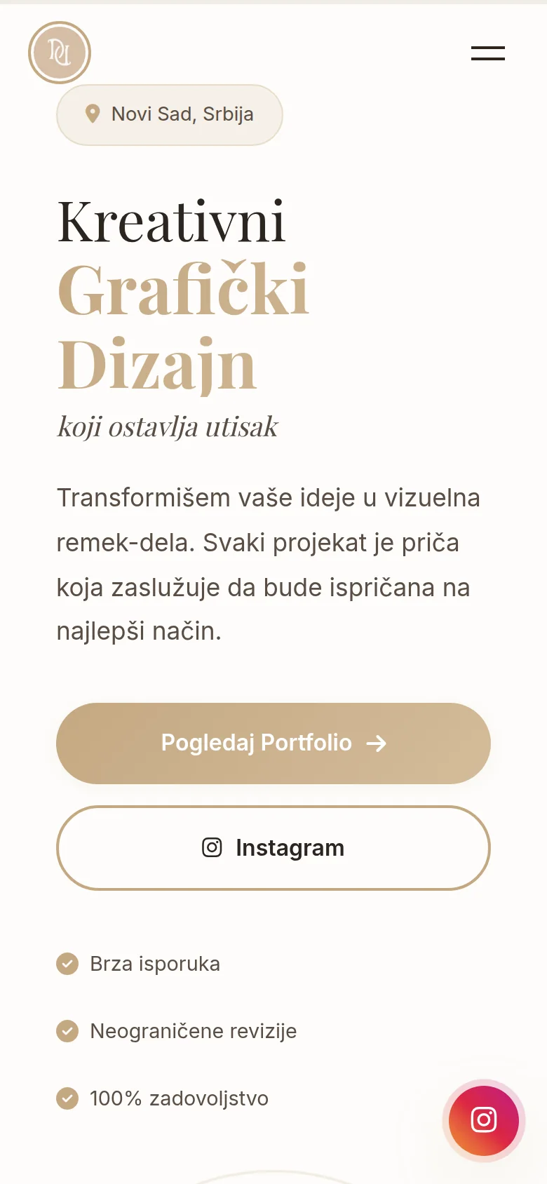
The site has been tested on four screen widths, from small phones to desktops. There is no horizontal scrolling, the menu switches to a hamburger on the tablet and lower, and the layout on the phone has been changed so that the text goes first, then the logo. Previously, it was the other way around, so the sign was seen first on the small screen, and the message was searched under it.
Accessibility is not left for later: at the top of the page there is a hidden link that leads directly to the content, the menu is marked as navigation, and the gray color of the text is enhanced until the contrast against the background has exceeded the threshold for readability. On a cream background with a gold accent, it had to — the light palette looks tame until you try to read the finer text.
Cookies, Analytics and Legal
A portfolio without a form feels like a site with nothing to report. It's not like that. There is enough analytics to create liabilities, and measurement that starts before consent is an offense regardless of how small the site is.
That's why analytics is set up through Consent Mode v2, with all categories in the initial state of declined. The measurement script is not loaded until the visitor clicks "Accept All". Whoever chooses "Only necessary" gets a site that does exactly the same, only without measurement — and that's the whole point of the choice, which is not fake. The decision is remembered in the browser and respected on the next visit, and the site also reads the signal sent by the browser when the user has asked in the settings not to be followed.
This includes three written documents: privacy policy according to the Personal Data Protection Act and GDPR, terms of use and cookie policy in which cookies are listed by name — name, purpose, duration and who sets them. They are not copied from someone else's site. They write what this site actually does: who maintains the server and in which country, how long the records of the visit last, to whom the data is forwarded and how consent is withdrawn.
Since the site has no form, that's where the story of data ends — there are no messages to be stored, no database to store them in, no exports that someone would have to store. The most secure data is the one that is never collected.
SEO and visibility
On the one hand, a website can easily end up as a URL known only to those who have already received the link. To prevent this from happening, what is usually skipped for a one-sided presentation was done.
Structured data describes the business as LocalBusiness — name, description, logo, Novi Sad as city, Vojvodina and Serbia as area of operation, Instagram as official profile and four services with starting prices. Along with it comes a WebSite and a FAQPage. This is what tells the search engine that behind the address is a real business in a real place, not a page with pretty pictures.
The title and description are written for the search result, not copied from the introductory text. Each subpage has its own title and description. There is a canonical URL, a full-format shareable image for networks and messages, a theme color code, a manifest, a favicon, and a sitemap that lists all pages. robots.txt does not block anything except maintenance mode pages.
The 404 error has its own page in the same design, with a link back to the homepage and to the portfolio, and — more importantly — returns the real 404 status. A page that looks like an error and tells the server that everything is fine is the quietest way to enter a bunch of non-existent addresses into the search and dilute the site itself.
A little thing that is rarely done: the site has a security.txt with a contact, so someone who encounters a bug knows who to call instead of being silent or posting it somewhere else.
Outcome
What the client received
One website that does the job that Instagram doesn't: explains the offer, gives the starting price, describes how the collaboration works, answers four recurring questions and returns the person to the profile when they are ready to write. The URL can be printed on a business card, sent in a message or put in the profile description.
No monthly subscription for the platform, no plugins that break on the next update, no administration to protect with a password. A site is five documents and some style — it can be copied, moved and handed over to another at any time, without negotiating with anyone.
Maintenance is what actually happens, not the item in the offer: the certificate renews itself, changes go through git with a trail, and failures that occur externally — like that security policy that knocked down animations and icons overnight — are caught in regular checks of the entire fleet, not when a client reports that something is not working.
If one day your own domain comes along, the content and code go intact. It changes the address, sets up redirects and arranges the search record. Everything else remains as it is.
FAQ
Frequently asked questions
Why a site when there is already an Instagram profile?
Because the profile shows the works, but does not explain the offer. Who does what, how long it takes, what they get at the end and how they get paid — that doesn't exist on the profile as permanent information, but as a post that wanders back. The site keeps it in one place and returns the visitor to the profile when he is ready to contact you.
Why is the site on a subdomain and not on its own domain?
Because it was agreed upon — it started without buying and annual maintenance of its own domain. Content and code are the client's. When he wants his own domain, the site moves as is; it's changing the address, setting up redirects and sorting the records in the search, not creating a new site.
Why is there no contact form?
Because it would be a weaker channel than the one that is already working. The message on Instagram arrives immediately, the designer is there anyway, and the conversation continues in the same thread. The form would mean one more inbox that is occasionally forgotten to be checked — and one more point where the site receives other people's data.
Why static HTML and not WordPress?
Because the four-service portfolio changes several times a year. The CMS would provide a database for that scope, an administration that is updated every month and an admin application kept online. The static page has nothing to hack through the application layer that does not exist and costs nothing per month.
How do services and prices change?
The change goes through the code and is published immediately. For a site that changes several times a year, it's faster than logging into the panel. The only thing that matters is that the price changes both in the visible text and in the structured data — both records are in the same file, one close to the other, just so that they don't diverge.
Does the site work on a phone?
It works, and that's where most people look, because most of the visitors come from Instagram. It has been tested on four screen widths, from small phone to desktop, with no horizontal scrolling. On the phone, the layout of the opening screen has been changed so that the message is visible first, and only then the sign.
Up next
Related projects
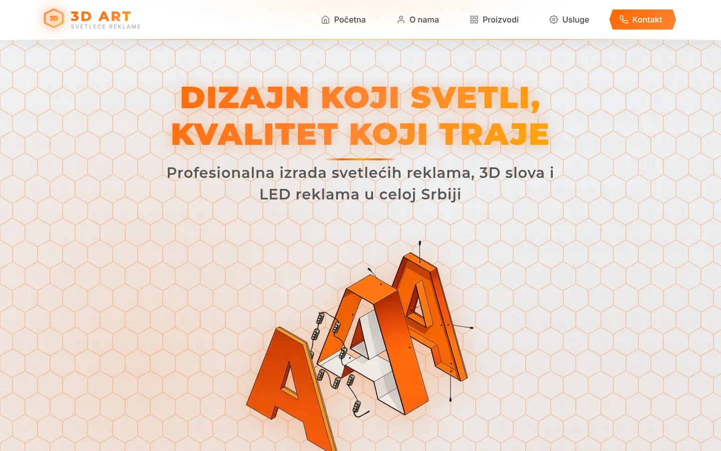
3D Art Kragujevac
Website of an advertising workshop from Kragujevac — illuminated signs, CNC and laser, galleries with over a hundred completed projects.
Case study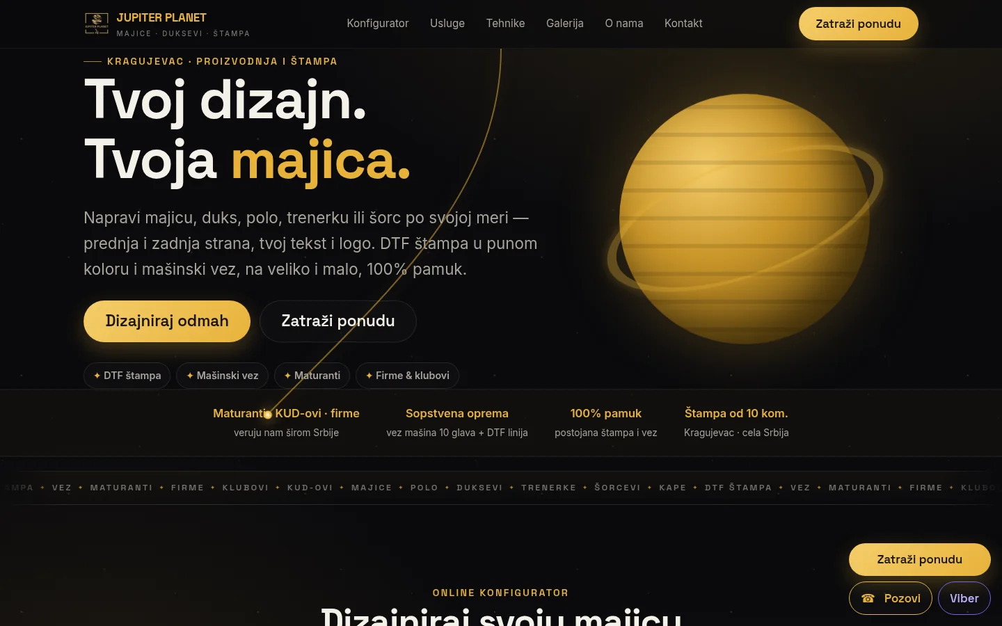
Jupiter Planet
The site of the Kragujevac workshop for printing and t-shirt embroidery — a configurator for the front and back of a garment, an inquiry instead of a cart and a page about techniques.
Case study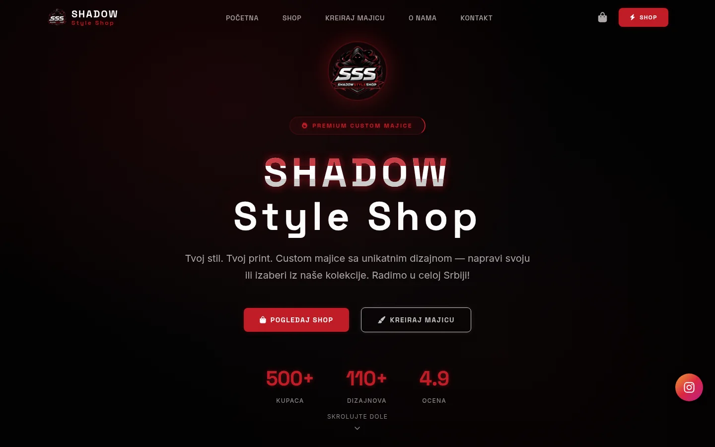
Shadow Style Shop
T-shirt store with print and your own design configurator — catalog, shopping cart, volume discount and admin panel.
Case studyNext step
Have a project that needs to work better?
Send me your goal and current situation. I will reply with a concrete scope proposal.
Start a project